Agency Work :: design work for businesses and organizations in a number of categories.
HUDSON VALLEY COMMUNITY COLLEGE :: TROY, NY
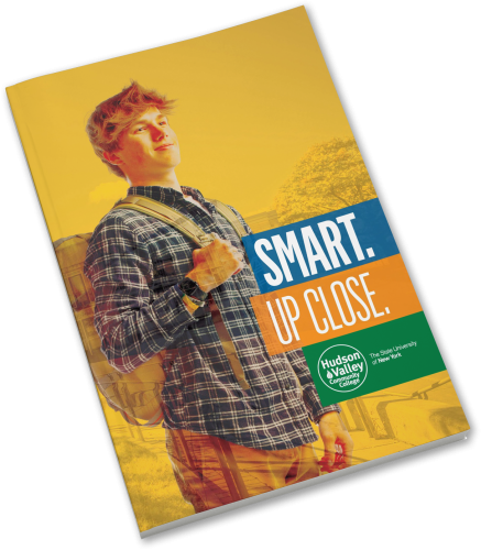
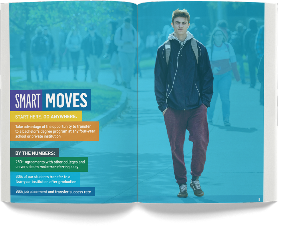
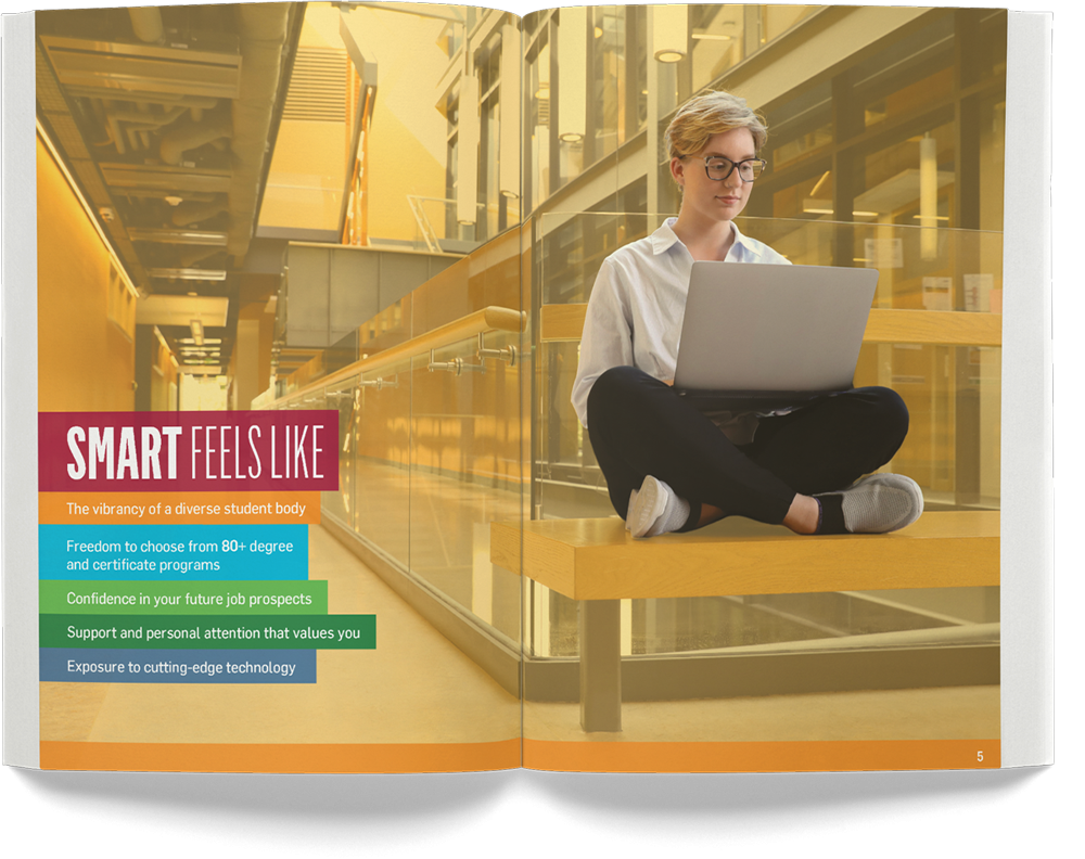
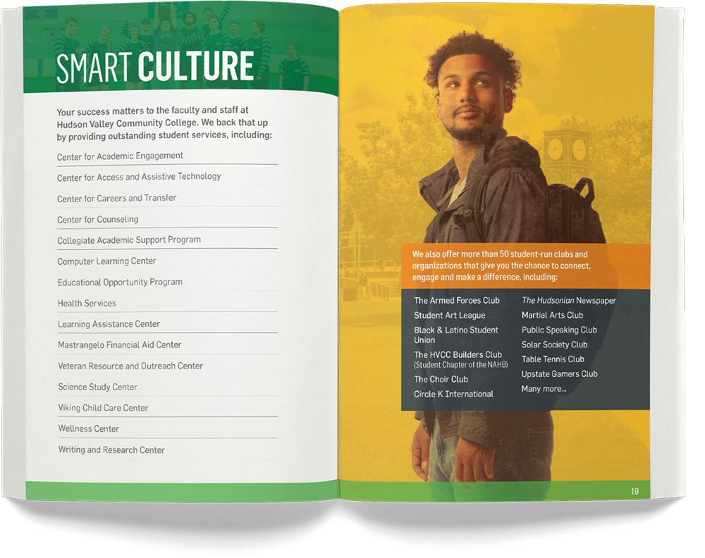
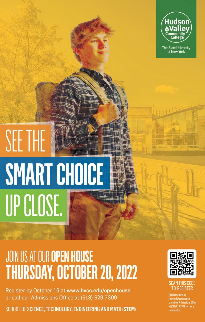
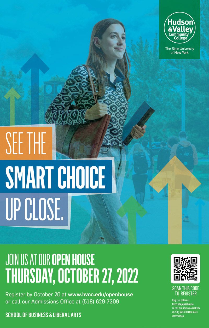
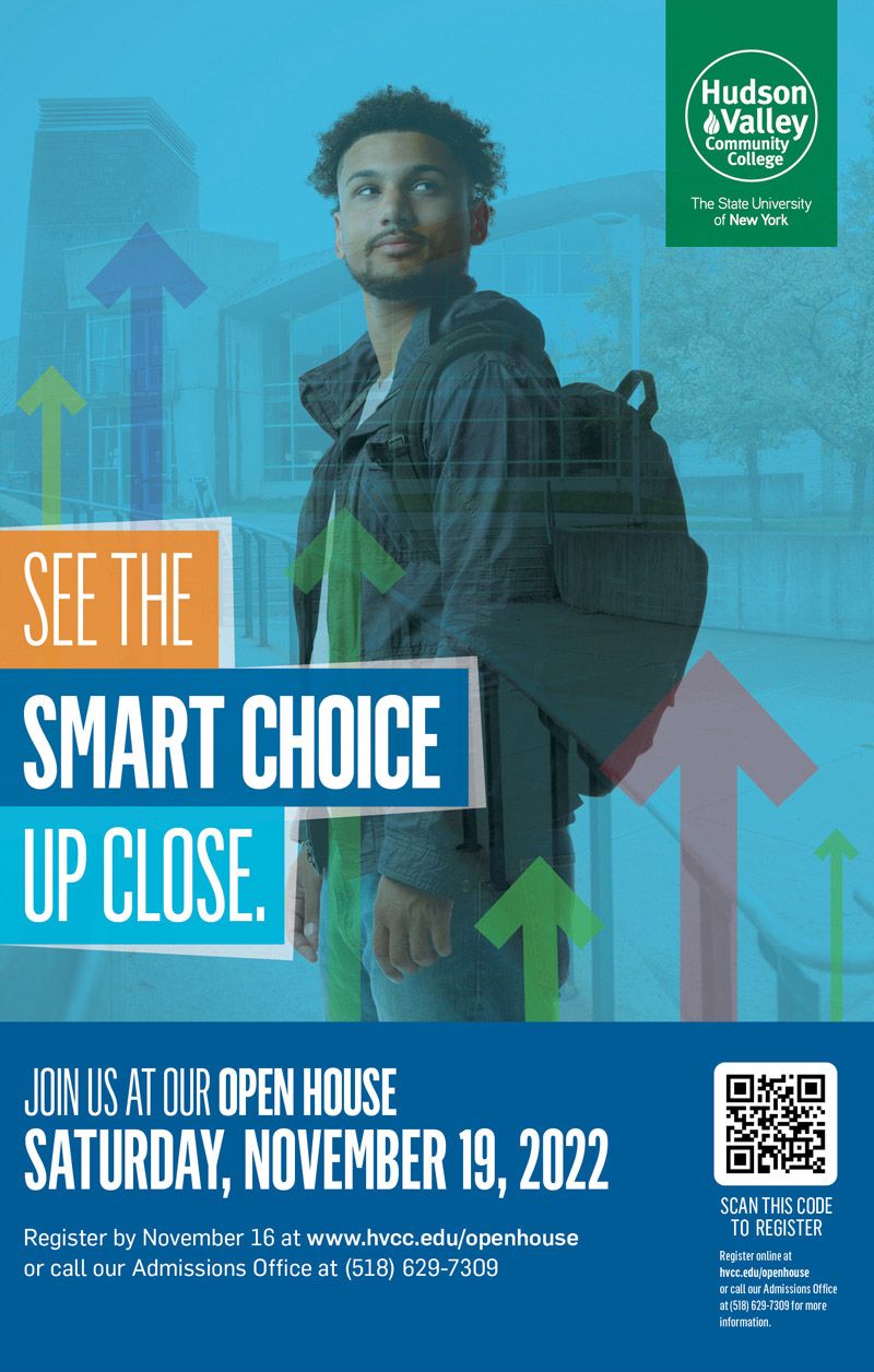
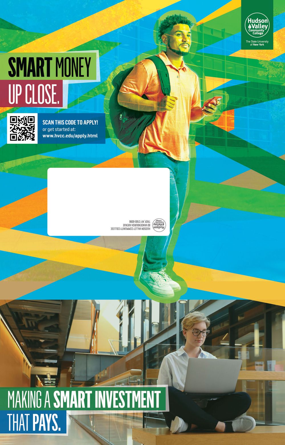
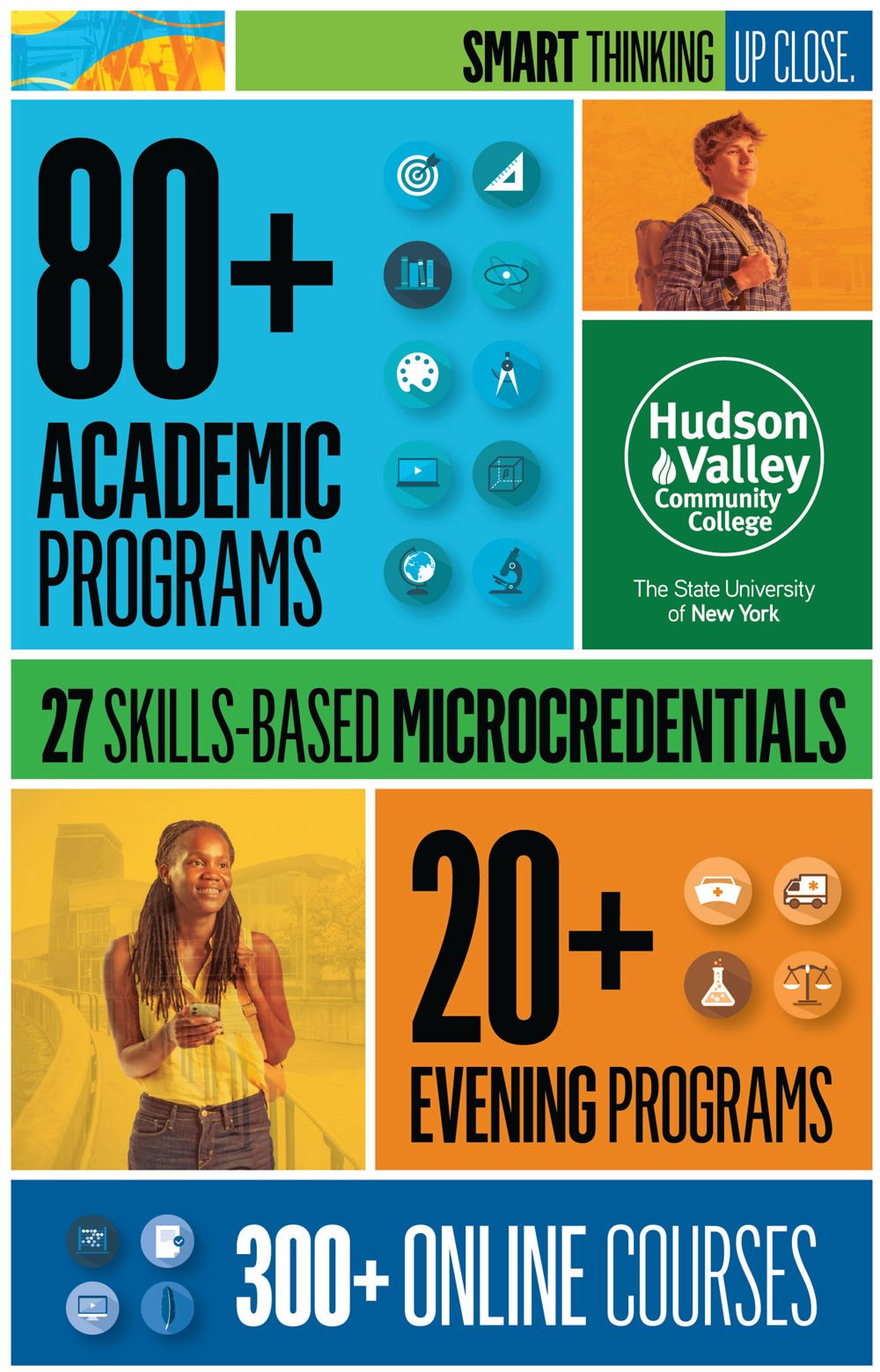
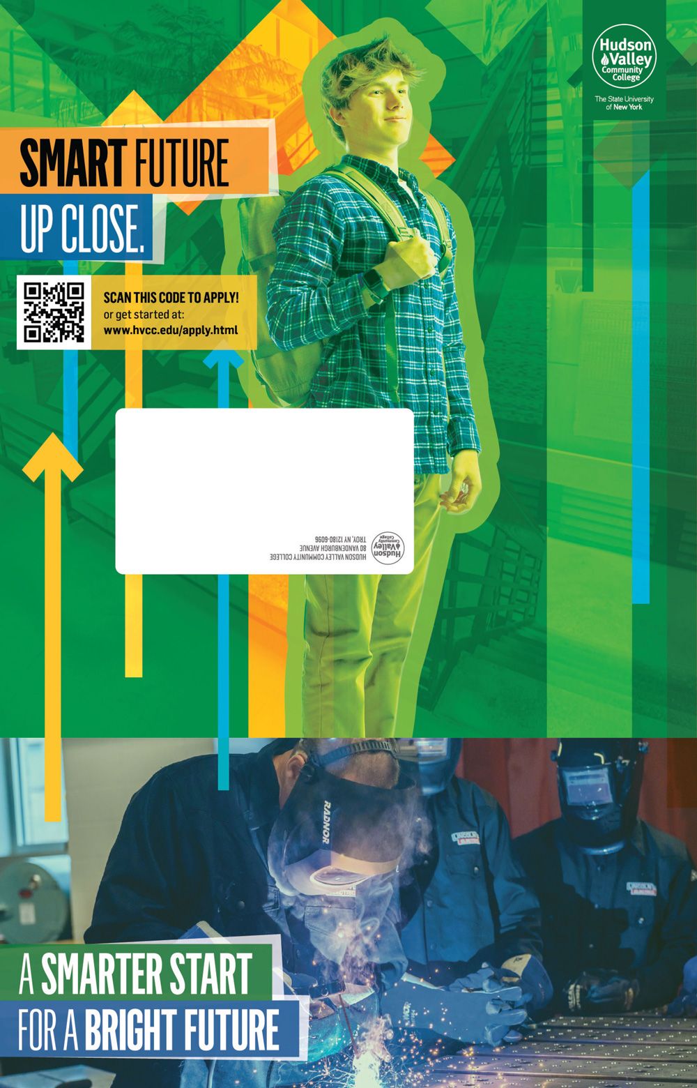
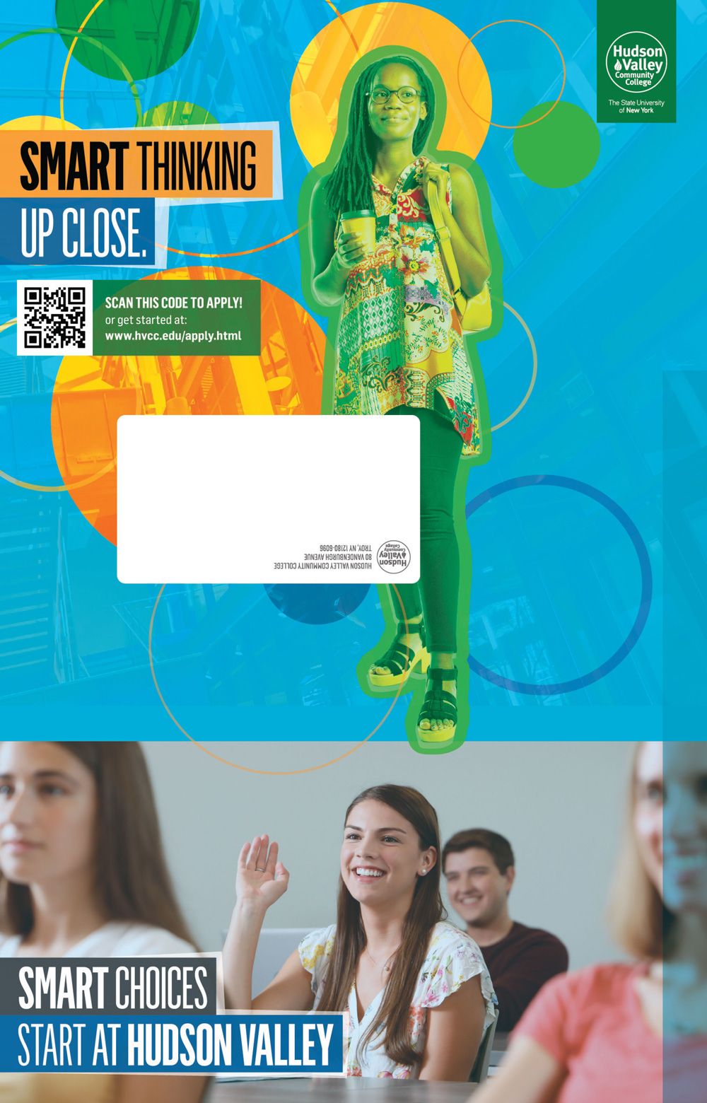
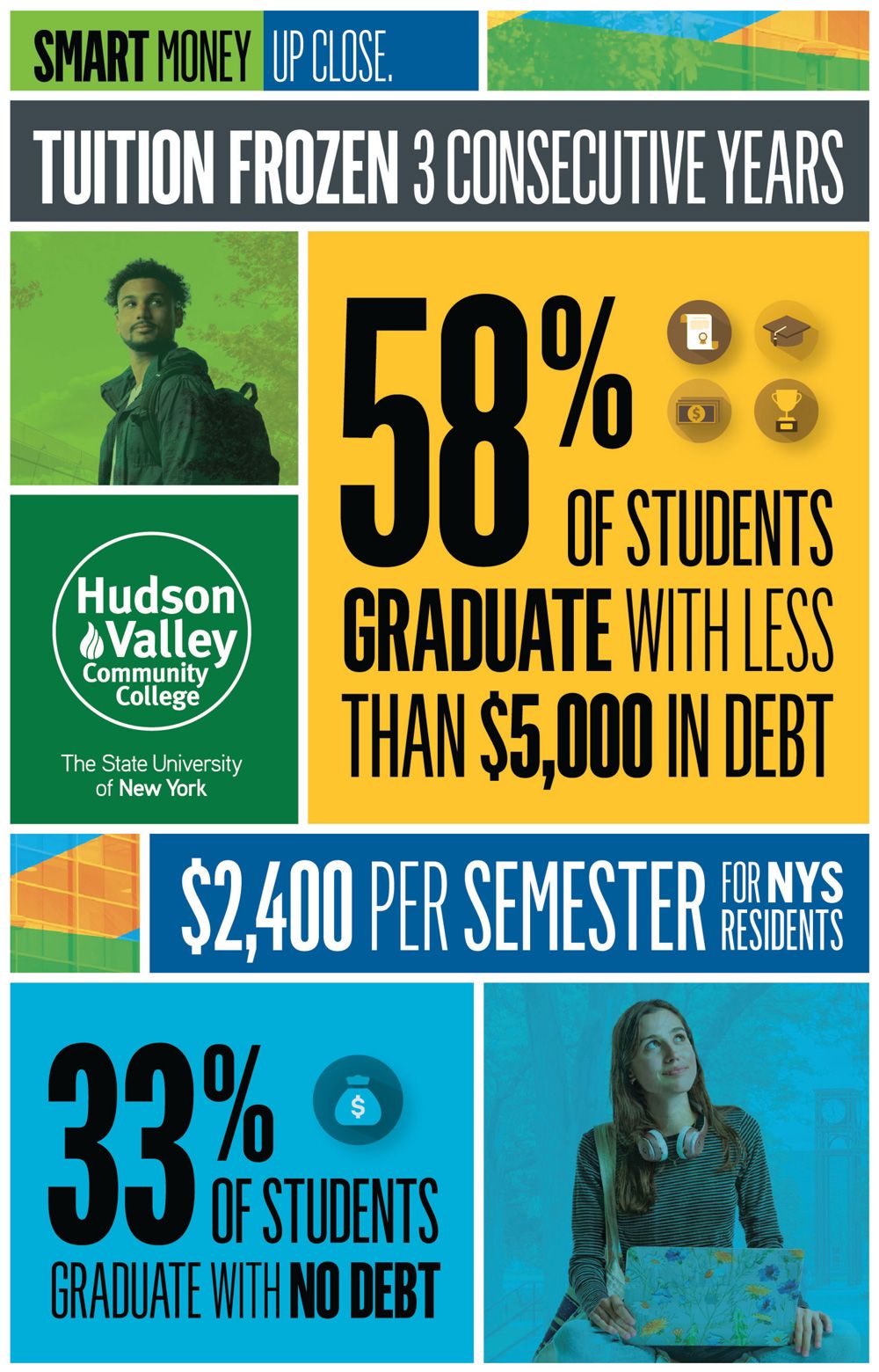
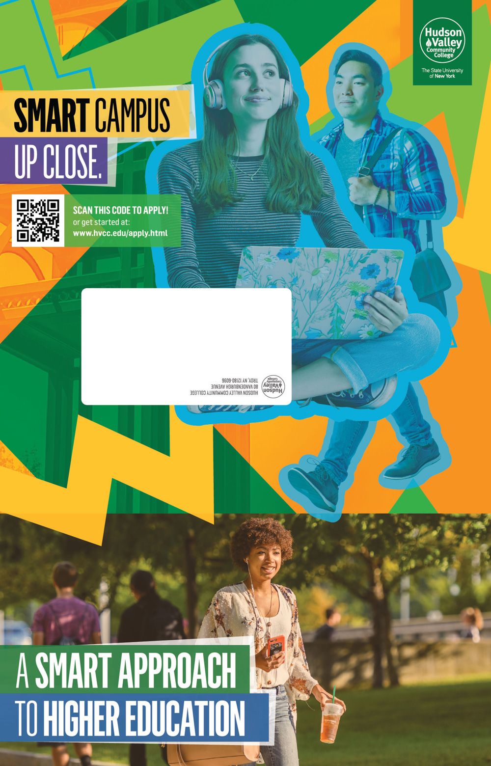
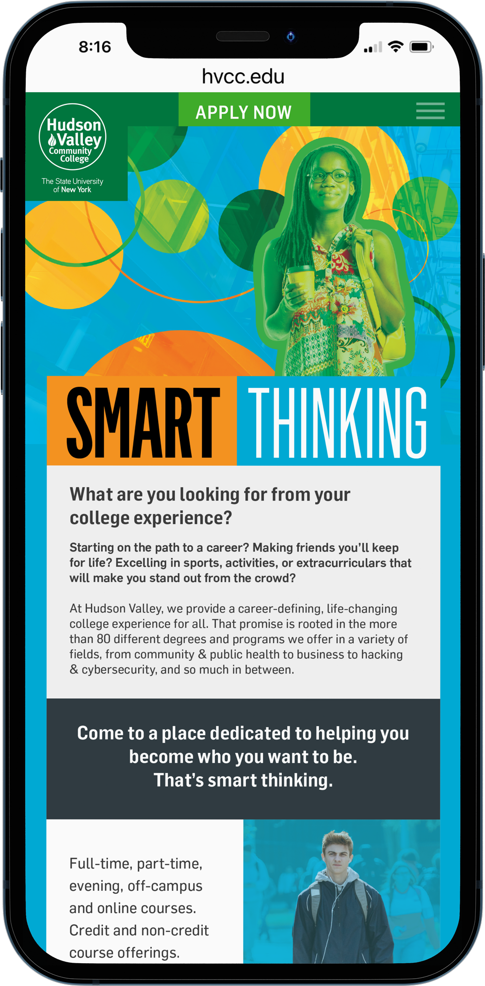
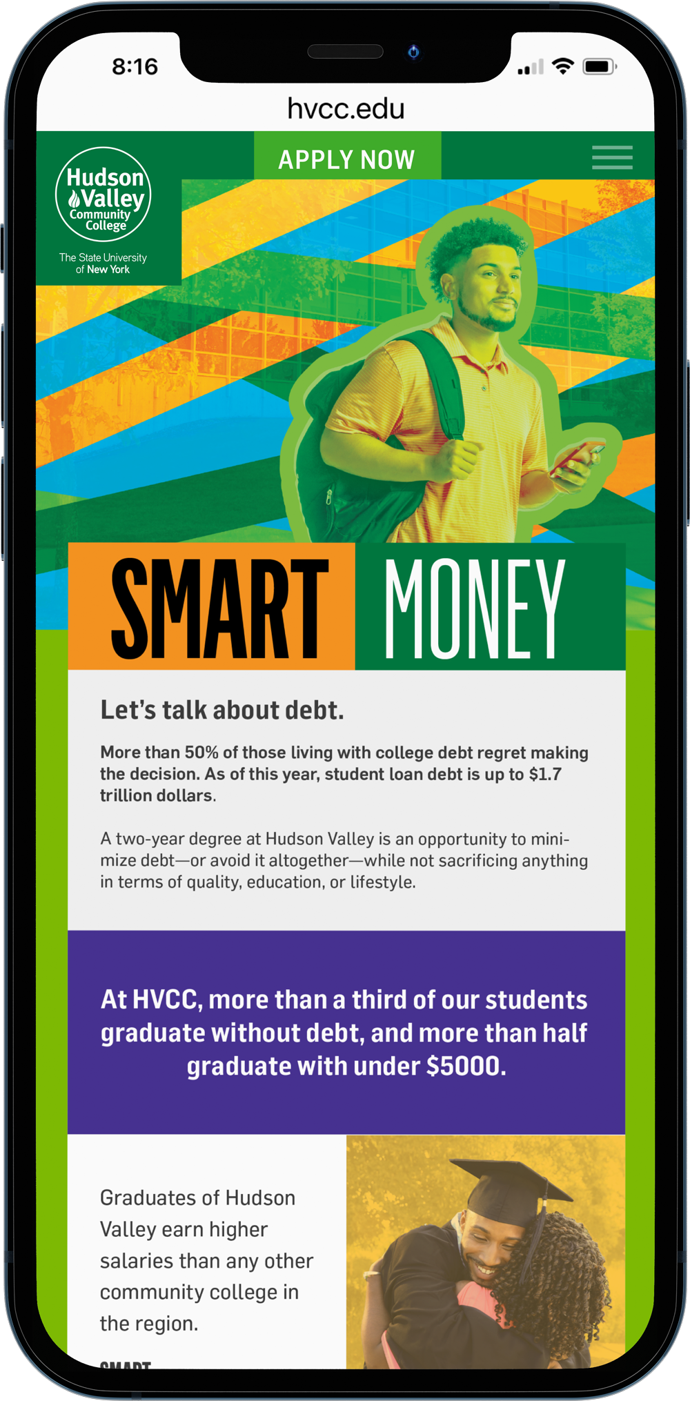
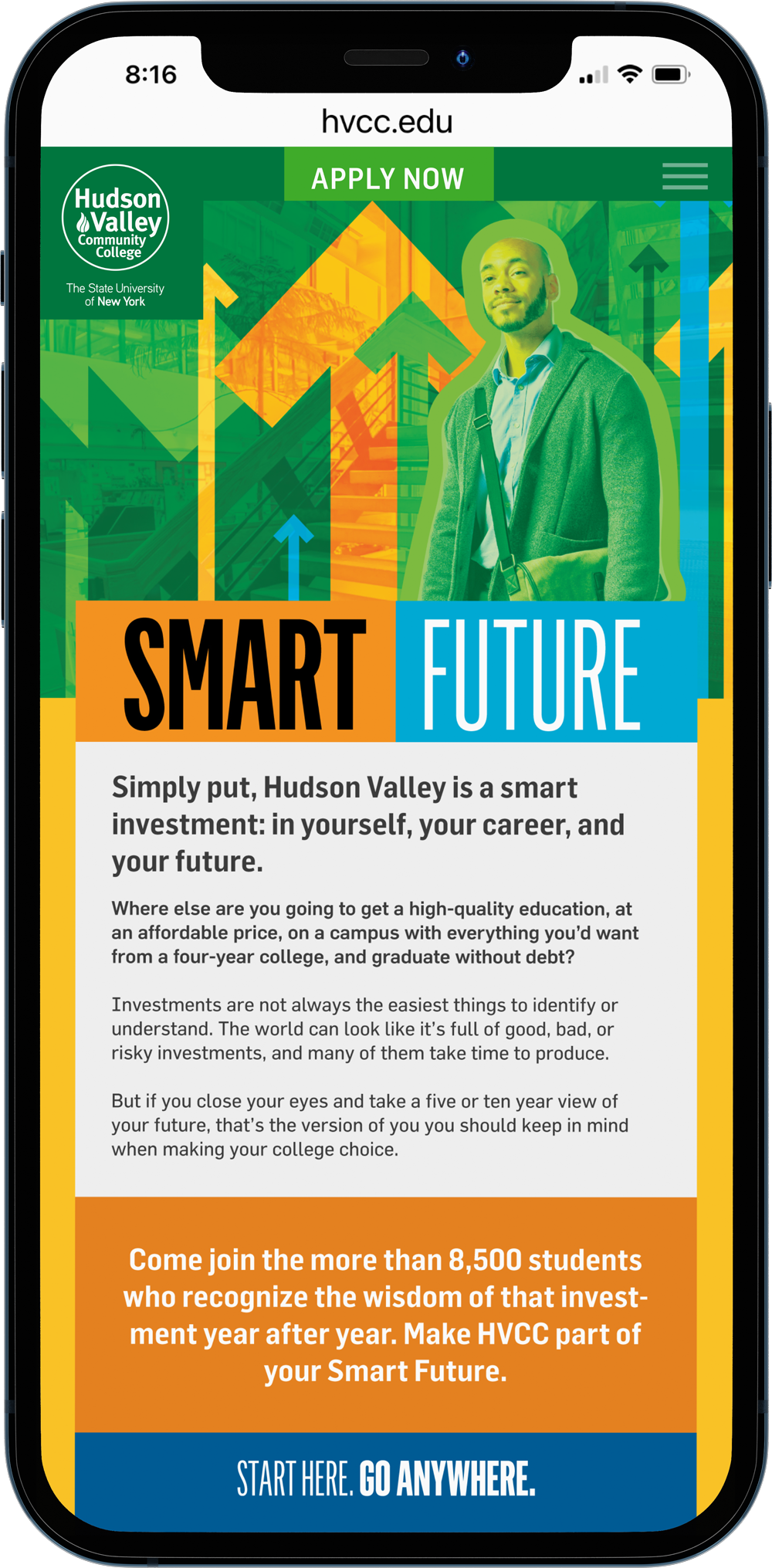
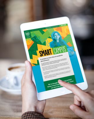
2022-23 HVCC integrated admissions campaign: Developing a new look and feel in higher ed for an established school can be challenging. Doing so within the confines of a college's strict brand standards is even more so. This campaign featured a photoshoot of students on a seamless in our studio and the strategic addition of a single type family to the college's visual toolbox. We were able to create a rich visual language for this work featuring those new elements across print, web and digital.
COLLEGE SEARCH BROCHURE

DIRECT MAIL
Print is far from dead in the higher ed space. Getting potential students—and parents of those students—to open direct mail is the challenge; especially when they are bombarded with other colleges' pieces. Smart copywriting paired with bright, engaging design was used consistently across the campaign to build brand recognition and elecit action.
CAMPAIGN LANDING PAGES & DISPLAY ADVERTISING
Ensuring the visual language we developed for this campaign worked in print as well as digital was paramount to its success. 16- and 17-year-olds consume media very differently than their parents. Teens are far more likely to spend time on their phones than on a laptop computer, so a strong mobile site was necessary.
DOWNTOWN ALBANY BID :: ALBANY, NY
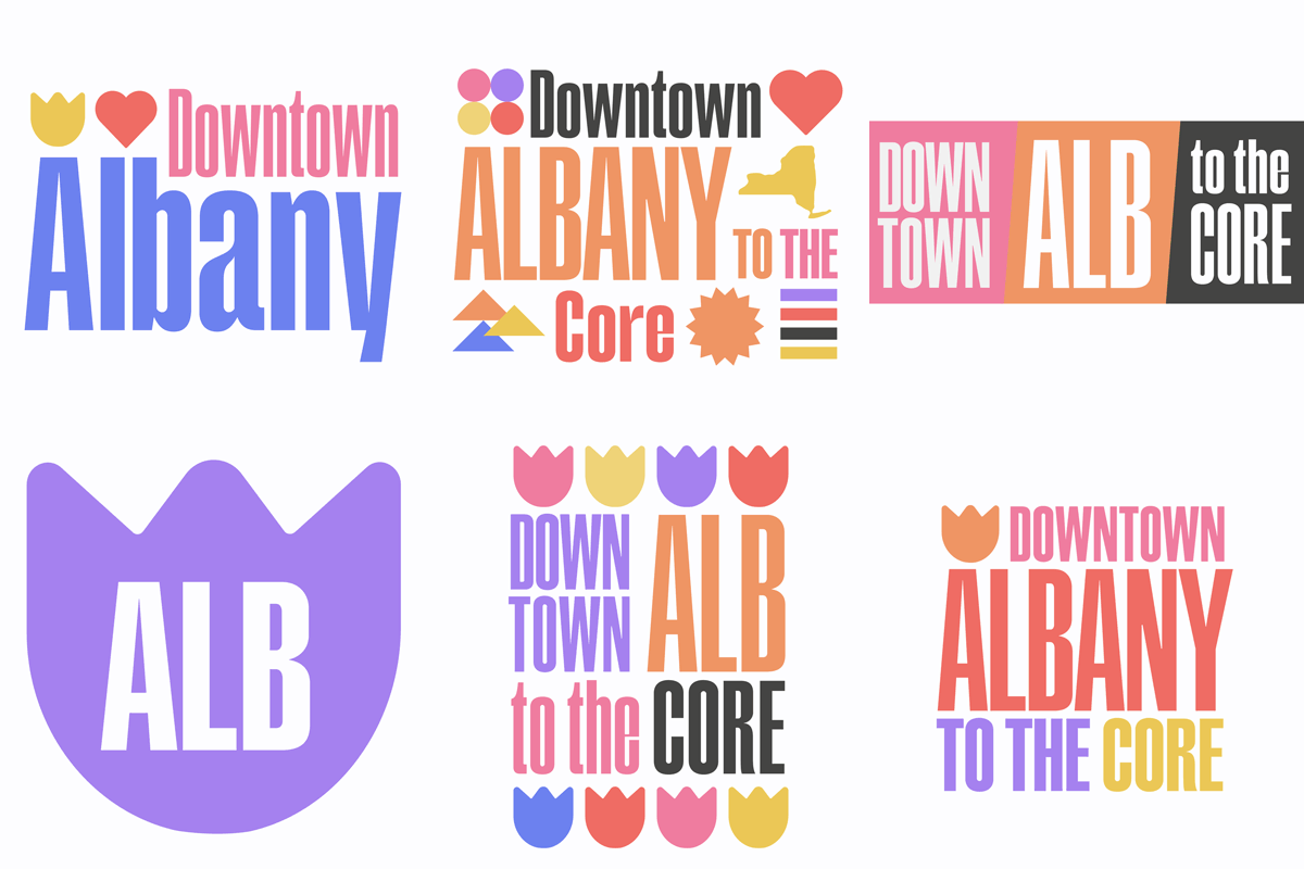
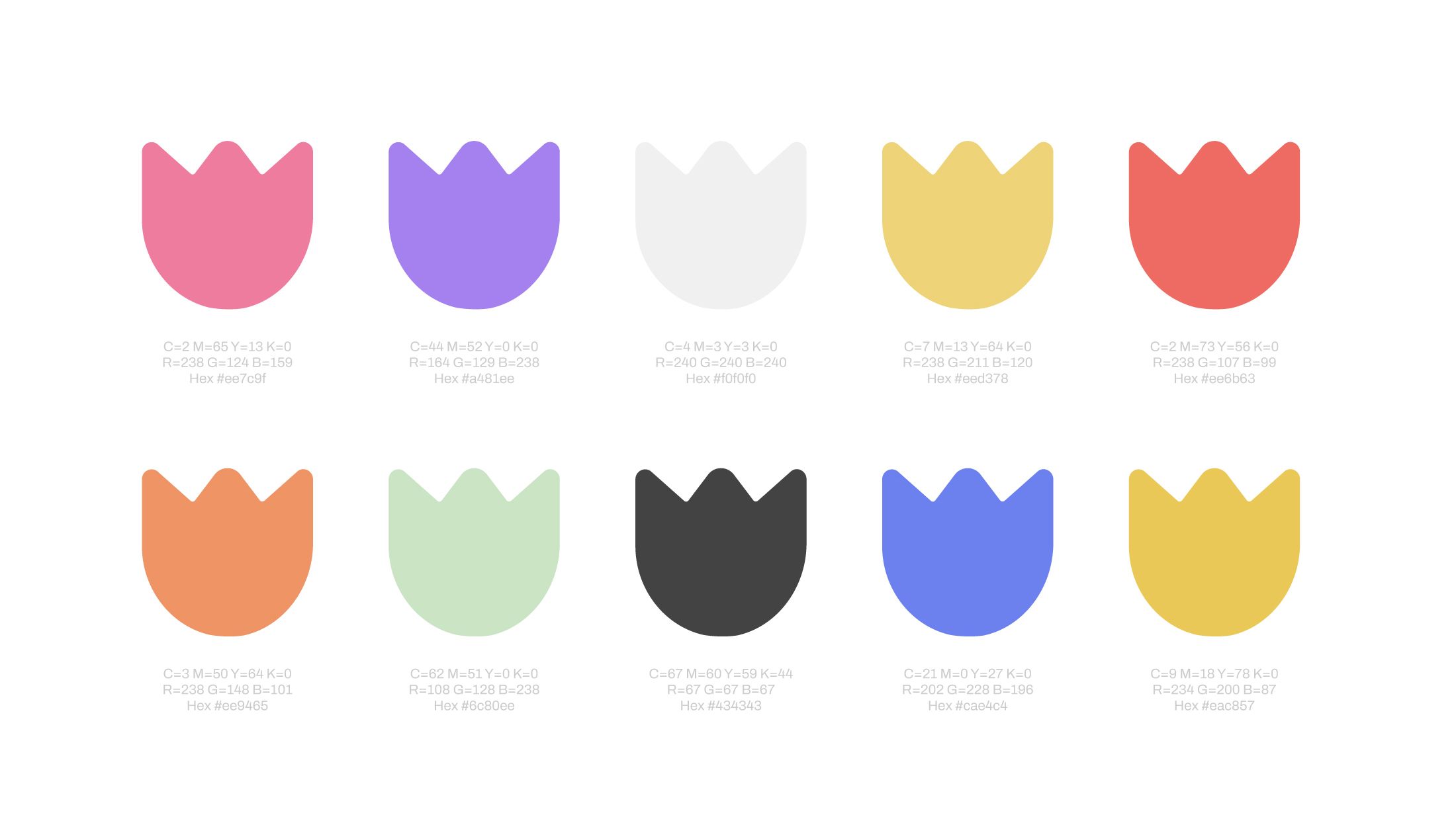
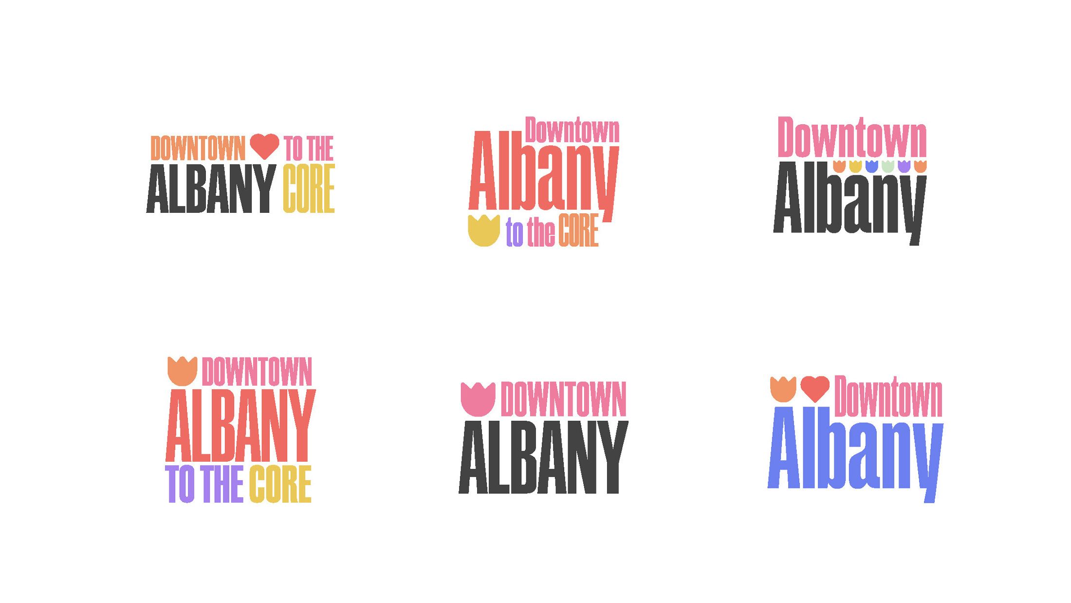
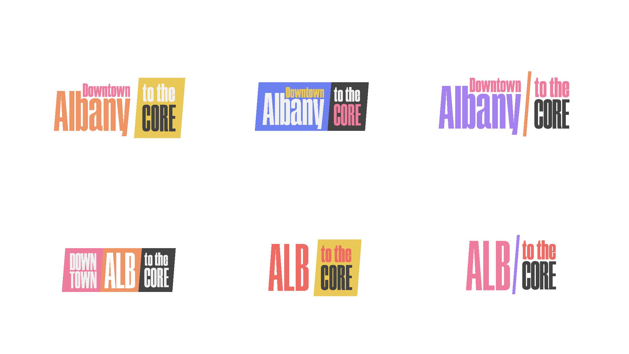
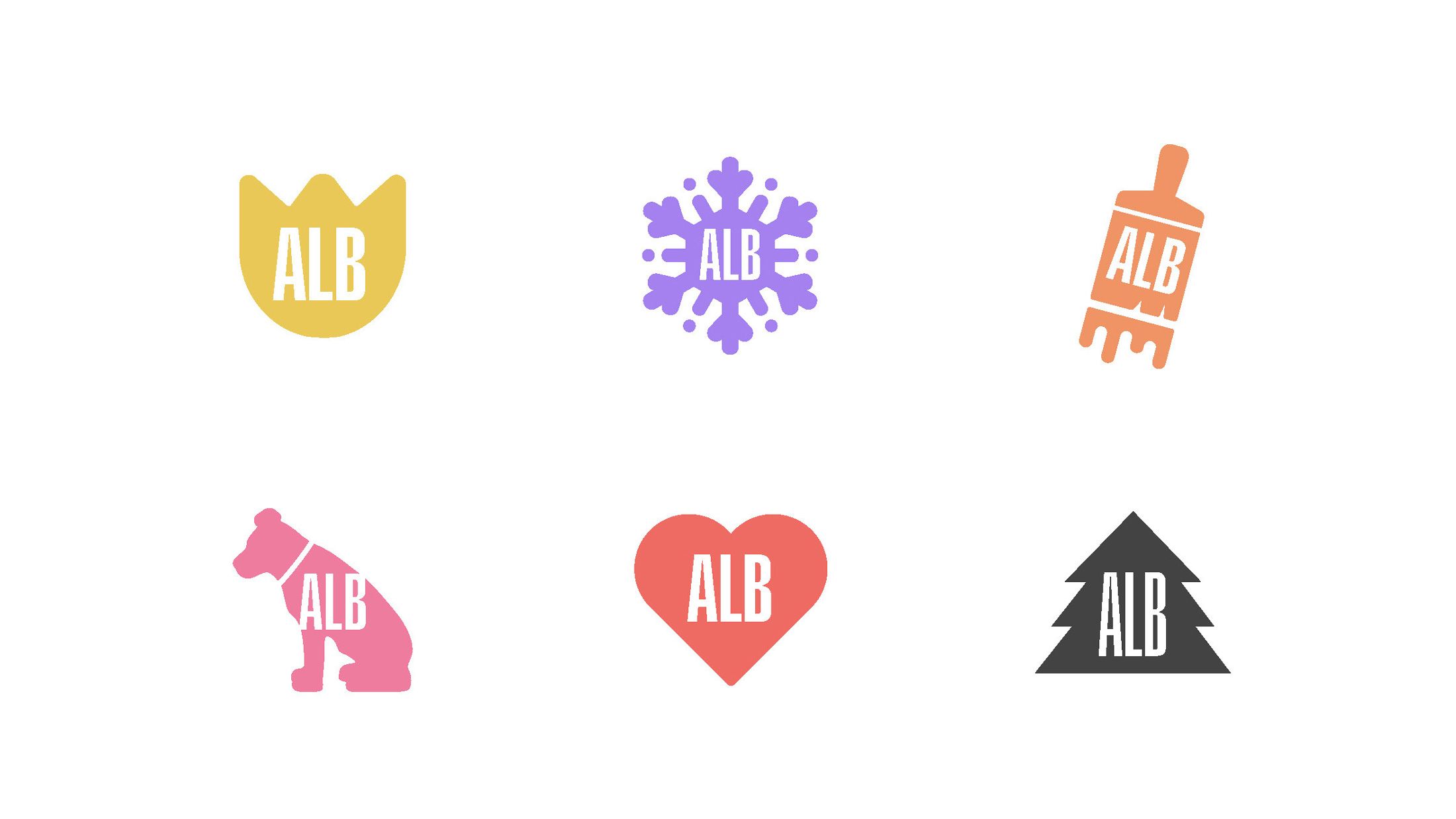
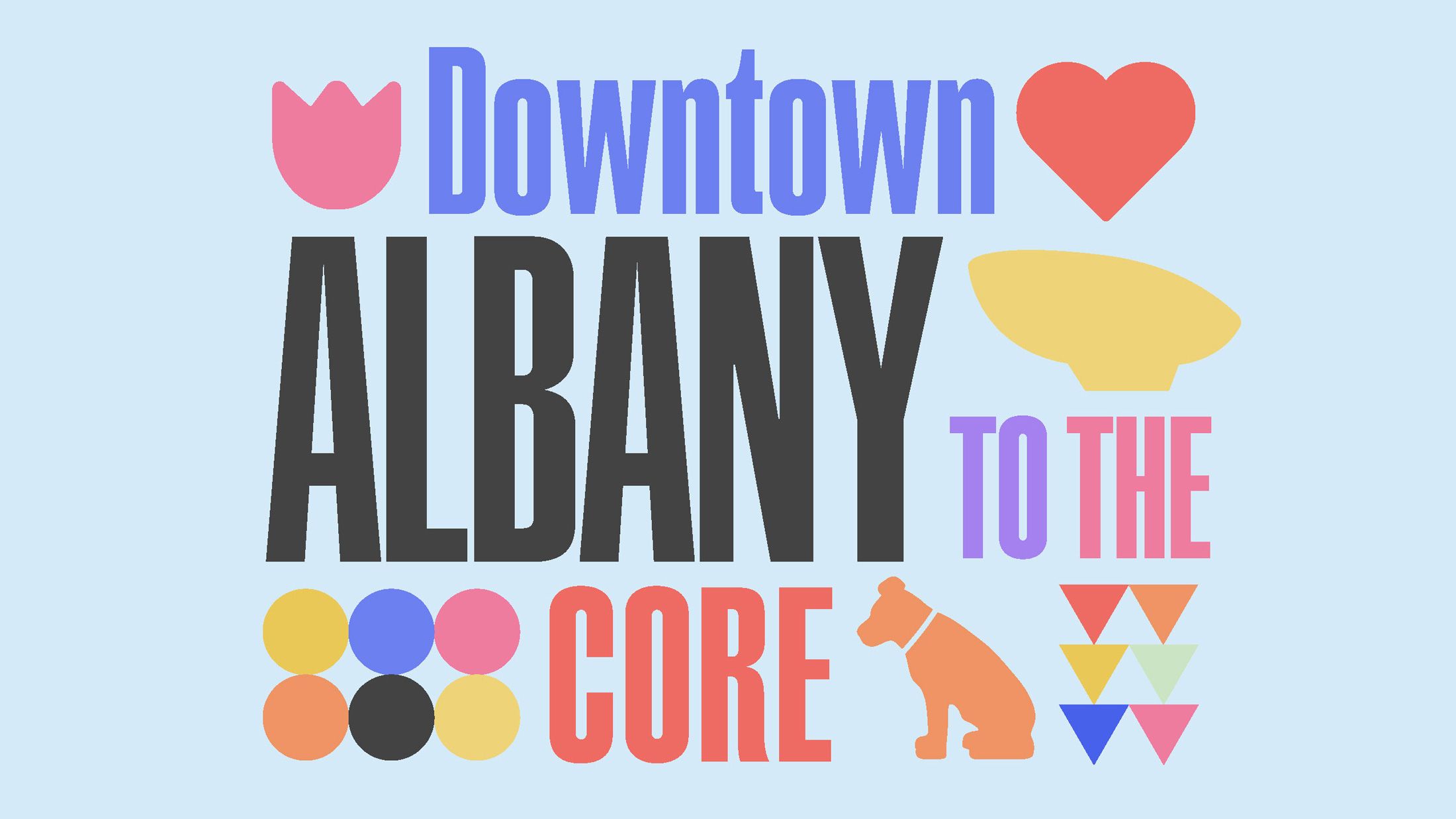
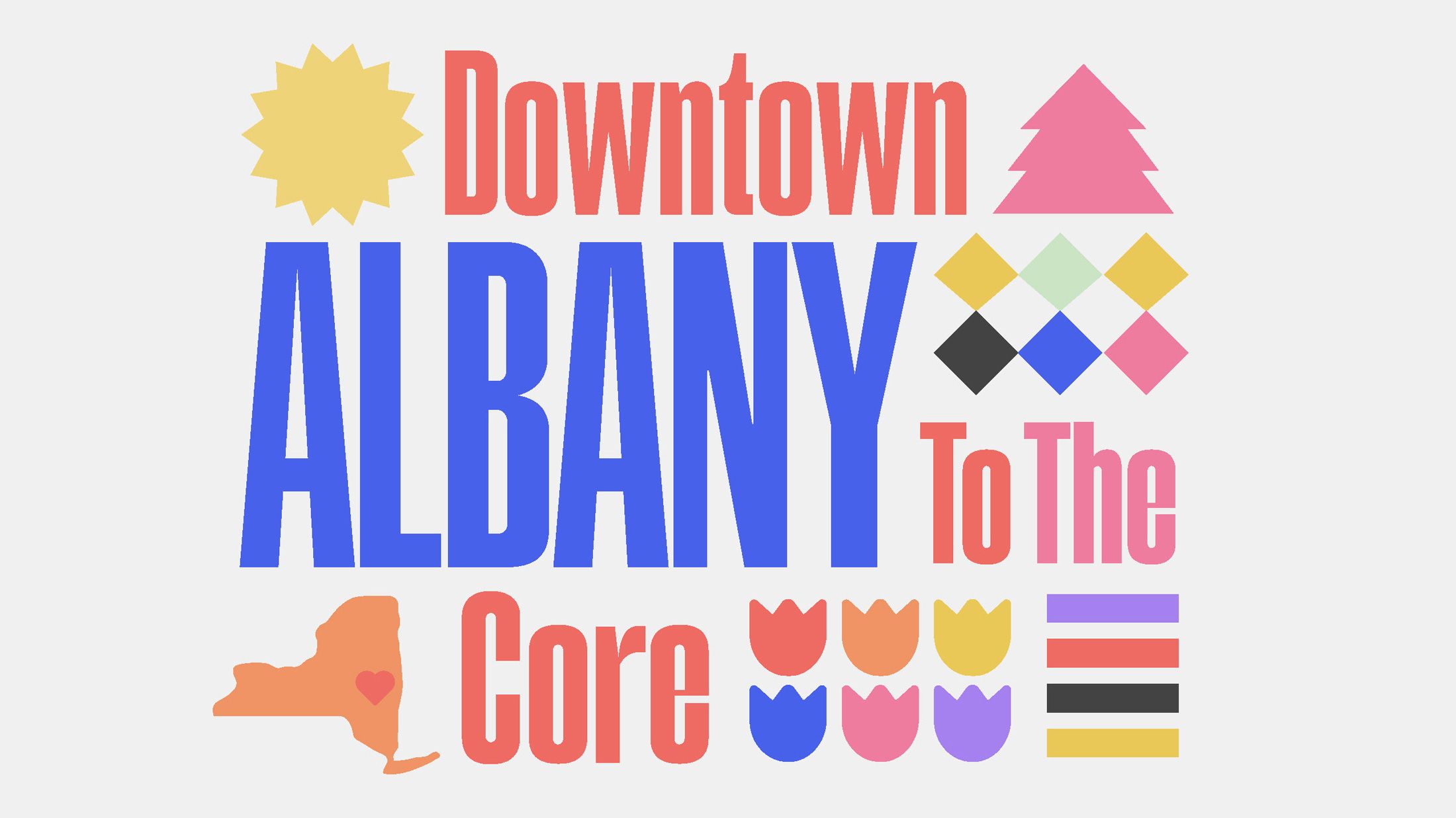
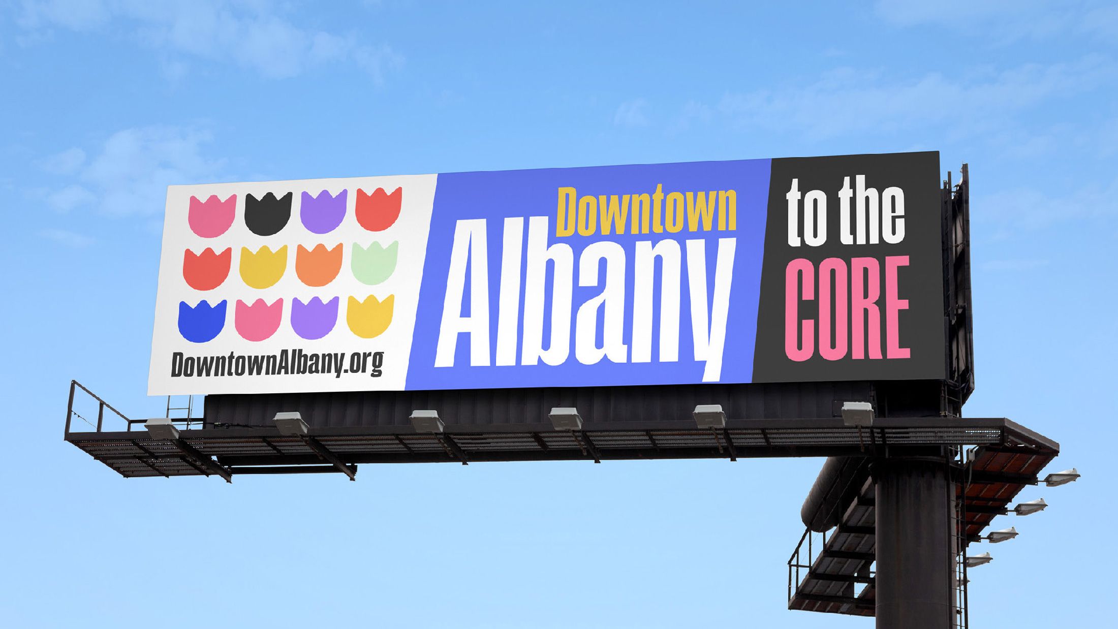
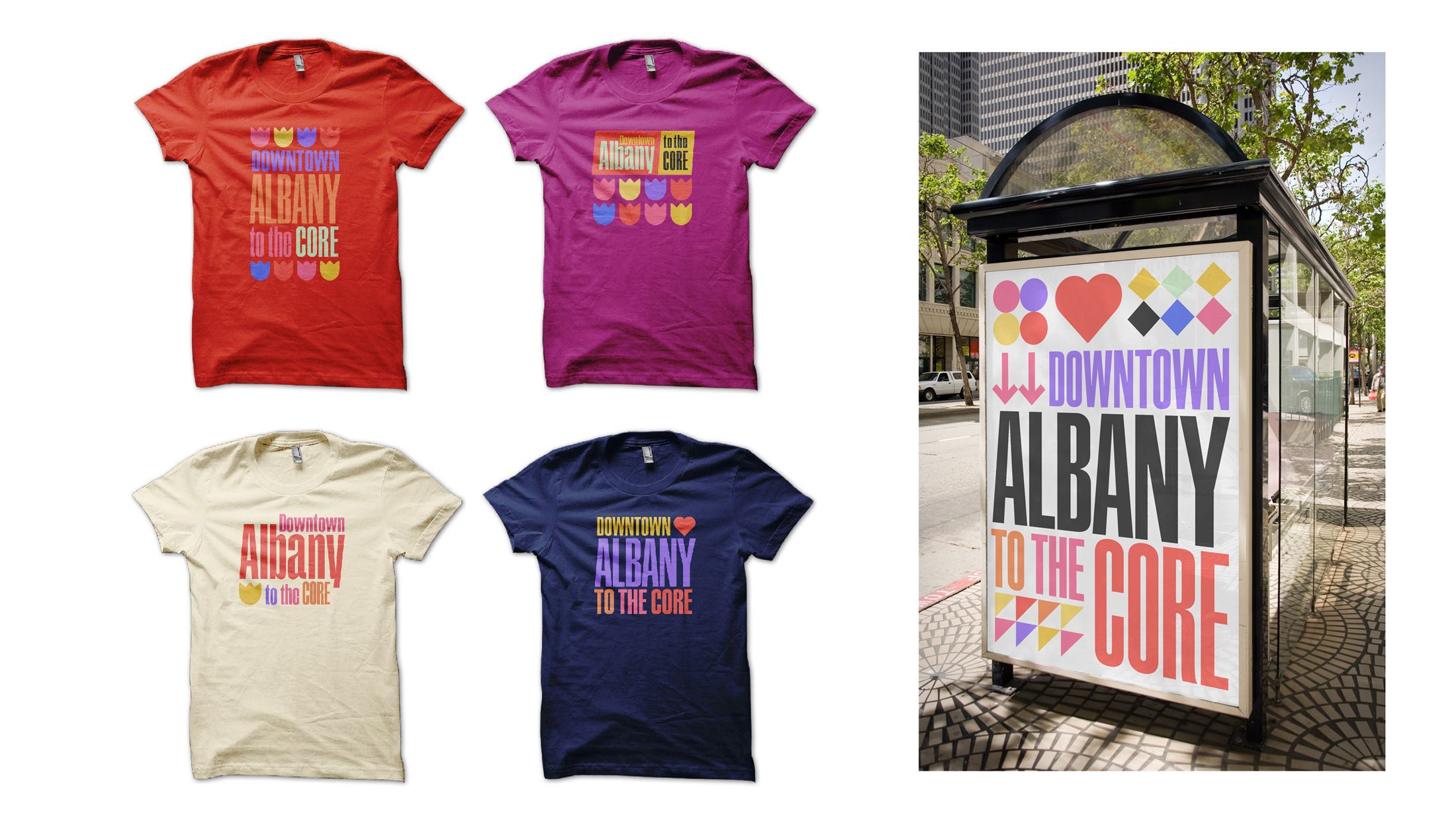
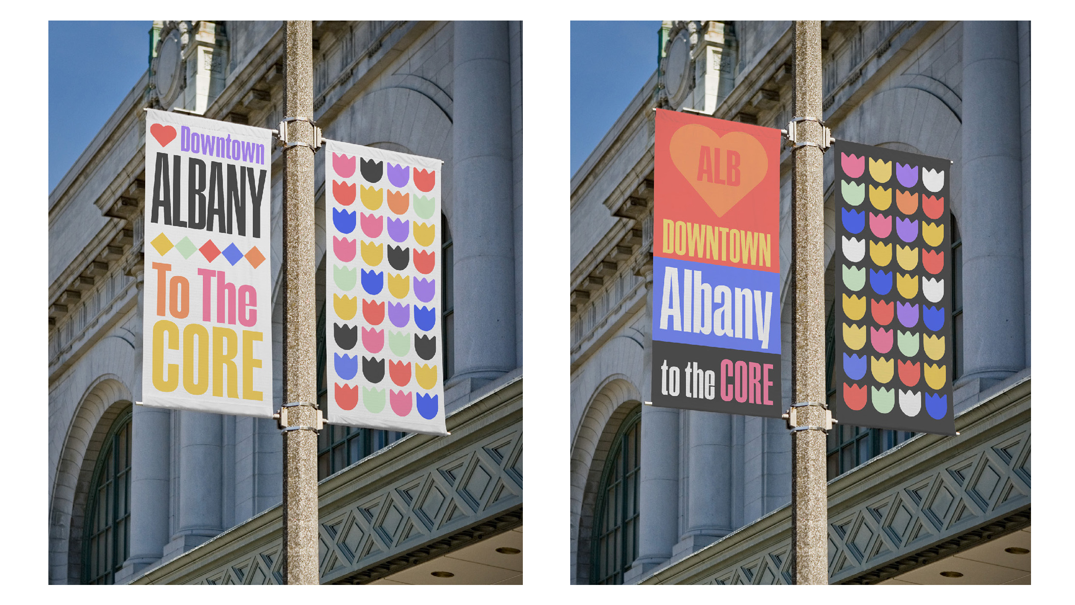
This design system uses 10 tulip-based colors, a variable compressed primary typeface and simple, local iconography to allow for numerous fluid lock-ups to represent the Albany Business Improvement District.
Rather than lock the BID into a single brand mark to represent and promote their organization, I sought to develop a visual narrative that intertwines modernity with a nod to Albany’s rich history. The goal of this campaign is to showcase Albany as the core that connects the full Capital Region together.
This rebranding campaign strategically deploys a mix of traditional and digital media to maximize reach. Engaging social media content showcases Albany BID as a hub for local businesses, public events, and community involvement.

CEDAR KNOLL LOG HOMES :: PLATTSBURGH, NY
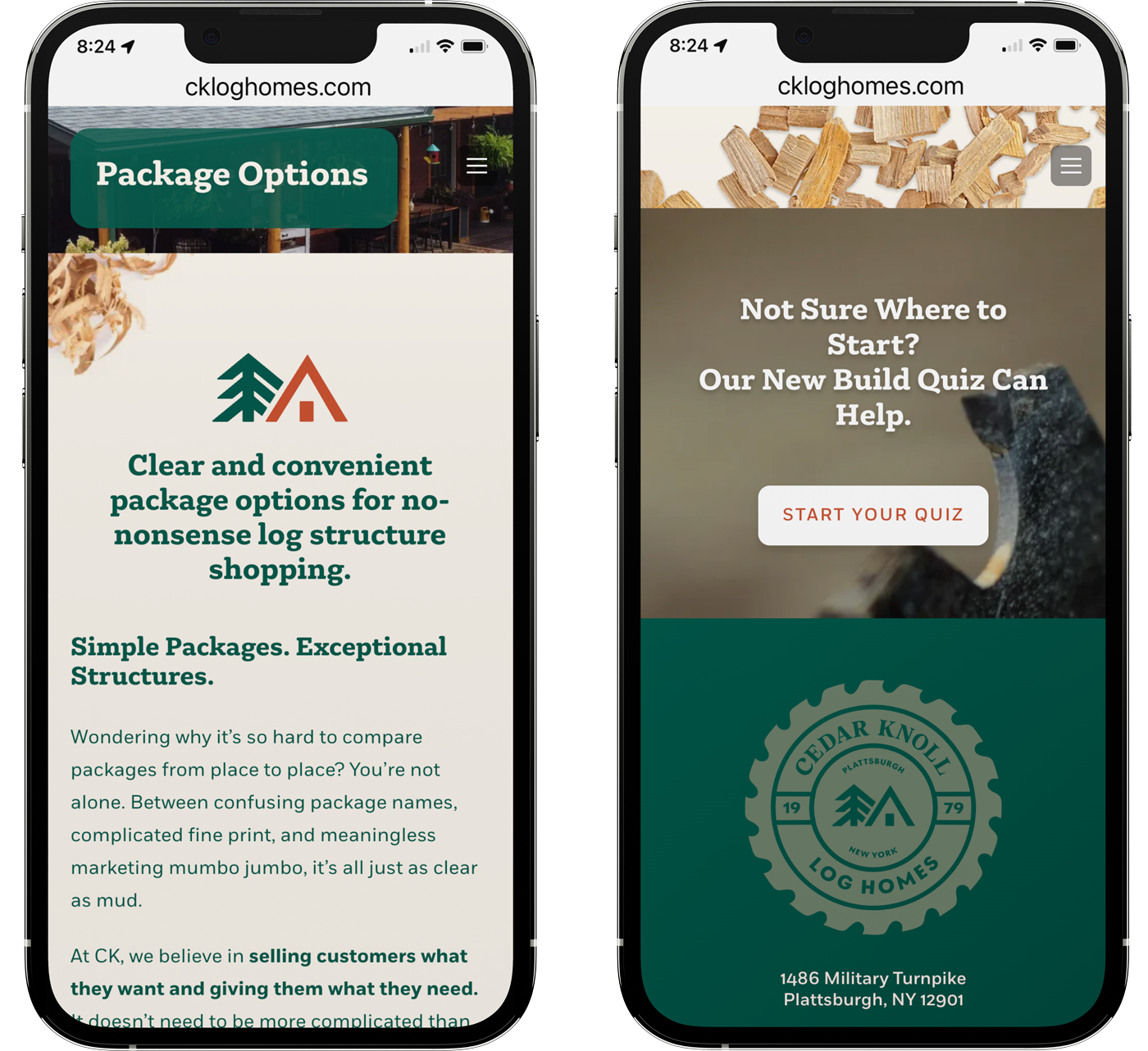
This 2023–24 project was an entire rebrand and site redesign for Cedar Knoll Log Homes in Plattsburgh, NY. We began with a set of modular, branded logo elements that included various lock-ups and badges. The site build contained 285 discrete pages that detailed all the optional elements available for the buyer. My role here was art director and initial page design and direction. Here's the finished product: ckloghomes.com
NEW YORK STATE PARKS :: ALBANY, NY
I was thrilled to be asked by the Office of New York State Parks, Recreation and Historic Preservation to help them redefine their visual brand and develop a series of stylized and branded posters for a number of parks across the Empire State. I grew up going to many of these parks, so I gratefully accepted the challenge and reached out to a talented local illustrator and Ithaca-based type designer to assist me in making something special. Below is some of the work for the first eleven parks, more to follow!
-
Previous mark
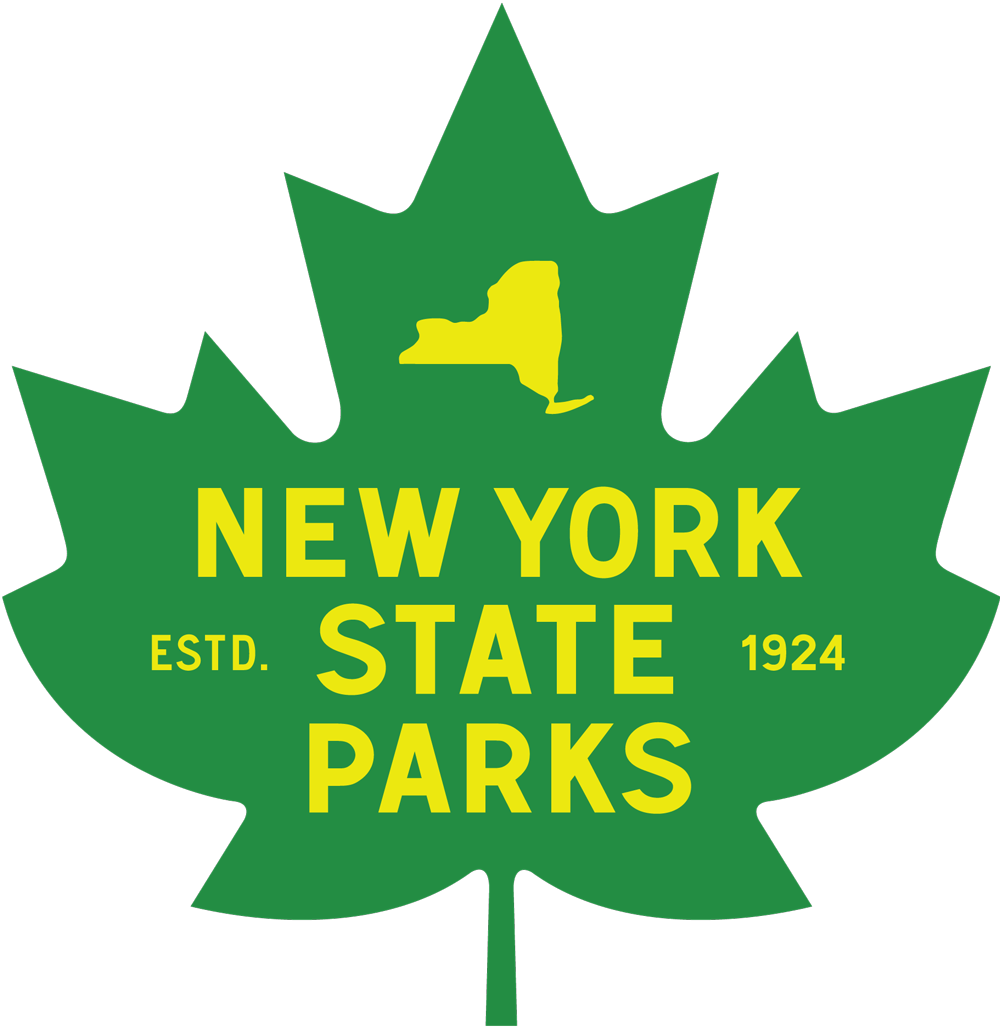
New mark
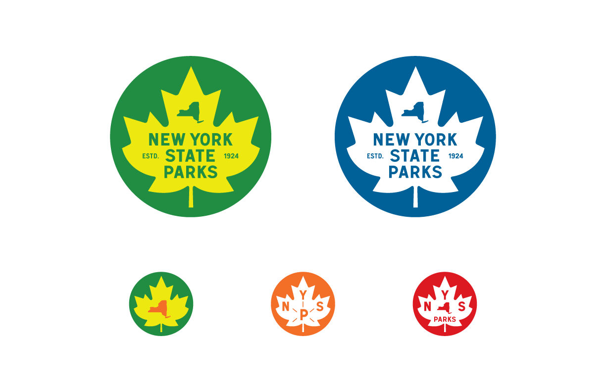
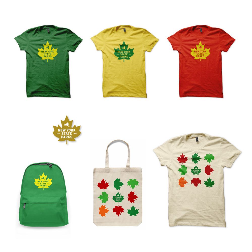
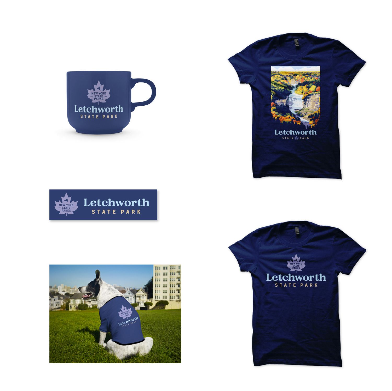
The new mark needed to be visually strong enough on its own for various merchandising opportunities.
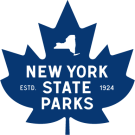
I designed a vibrant new mark for NYS Parks to replace their difficult-to-use and dated previous lock-up. The objective was to create an updated visual look crafted from known elements that could have been in use since the organization was founded in 1924. The new mark needed to be visually strong enough on its own for various merchandising opportunities.
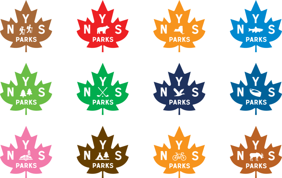
I used the new visual language to create a design system to promote individual activities at the parks. Derivations were designed for alternate lock-ups, brand patterns and social media avatars.

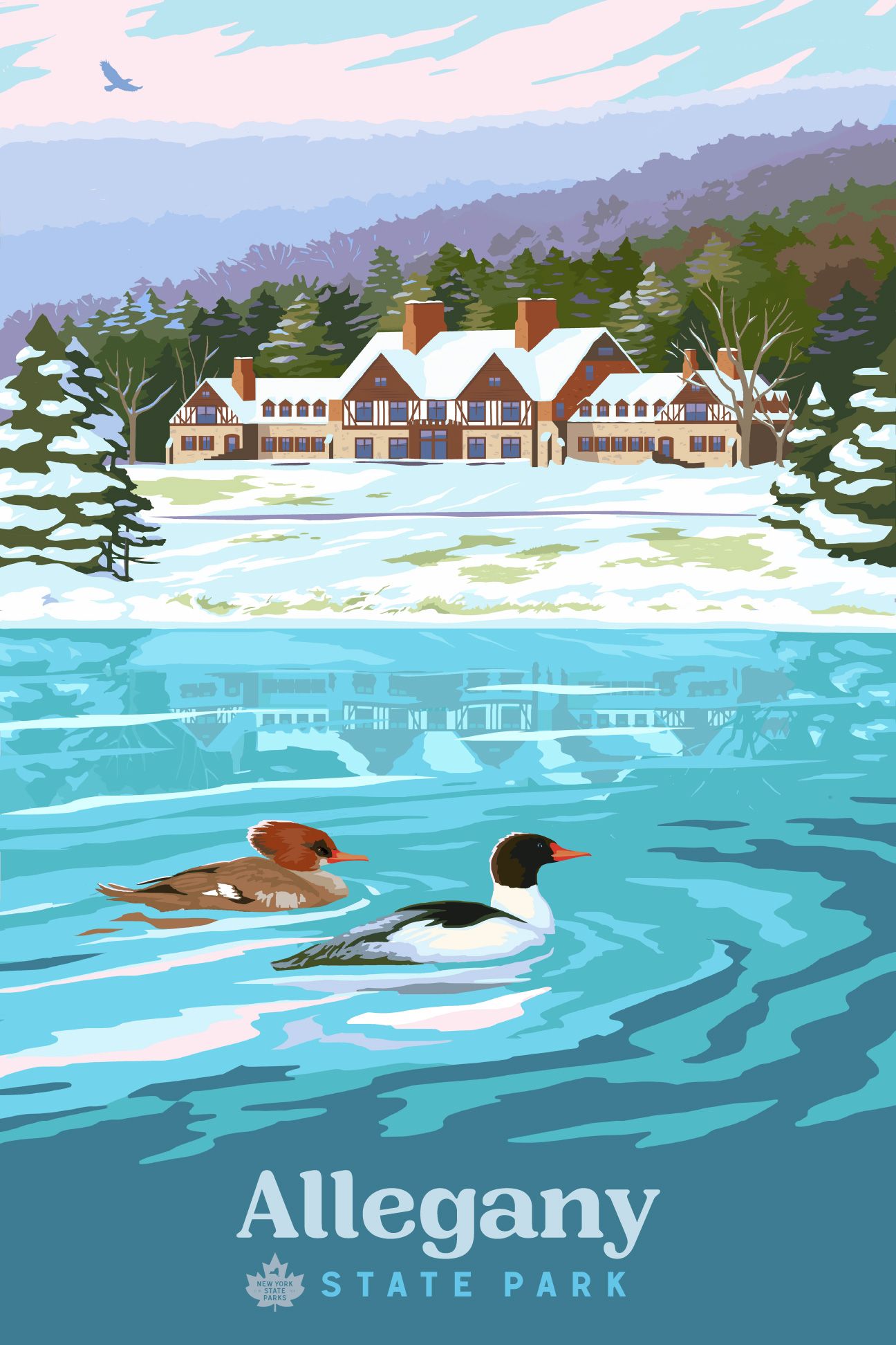
PARK POSTERS
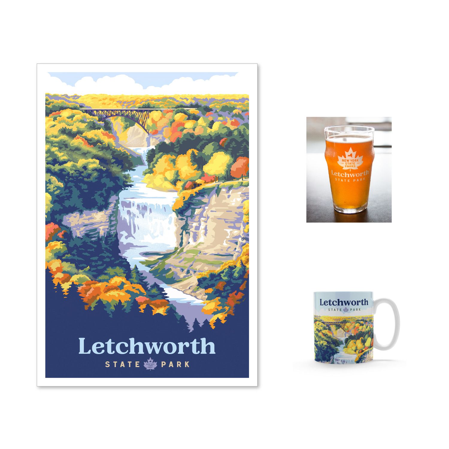
I was thrilled to work with friend and local illustrator Ben Karis on this project. Ben's style of digital illustration is vibrant, colorful and very modern, and I think his work here is amazing. Check out more at: benkaris.net
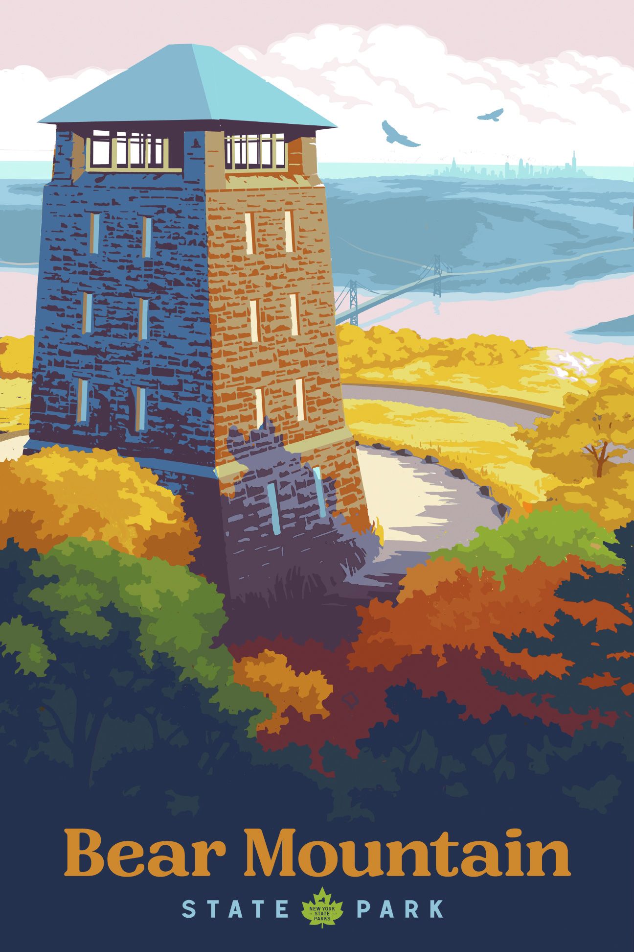
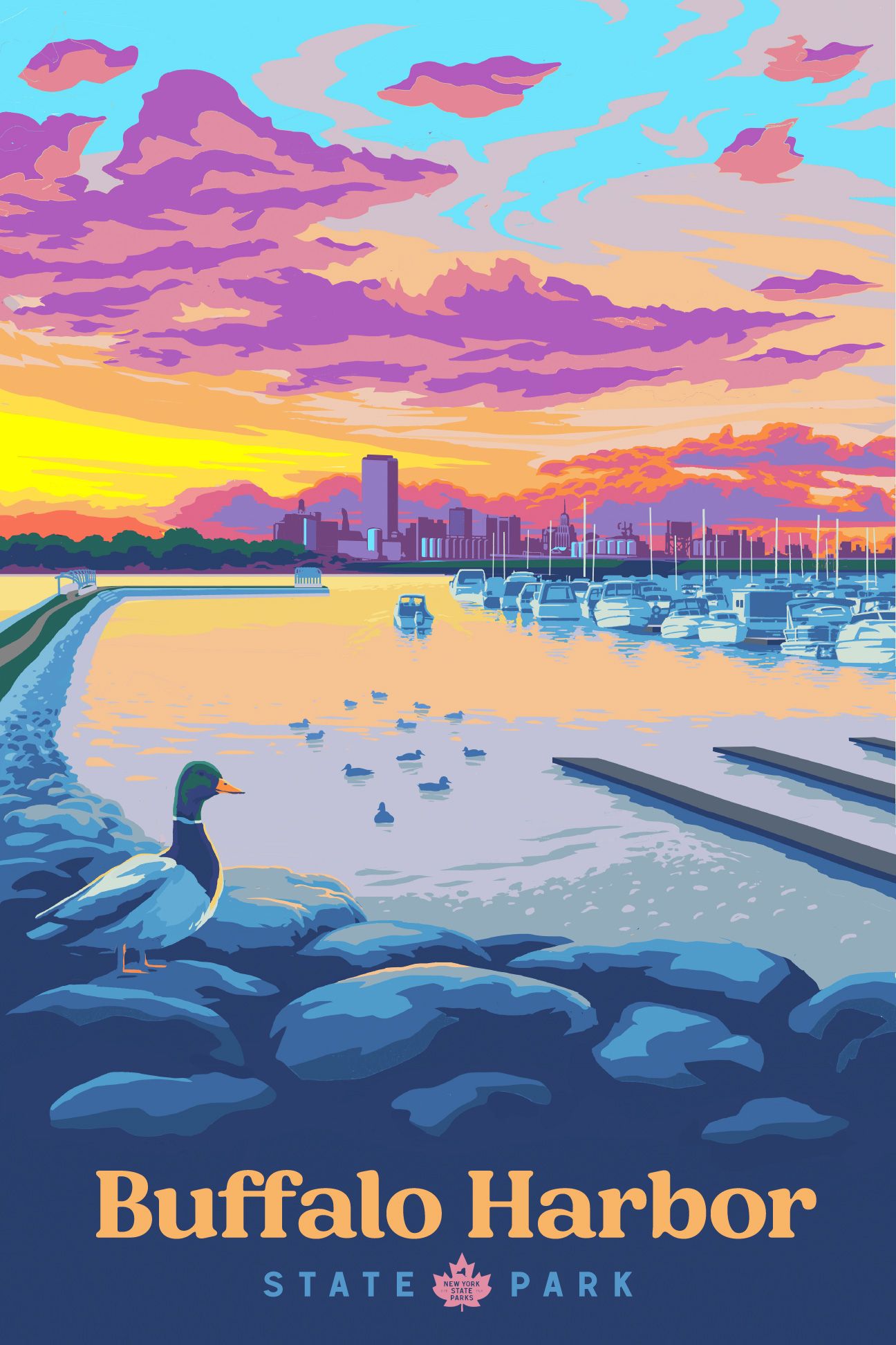
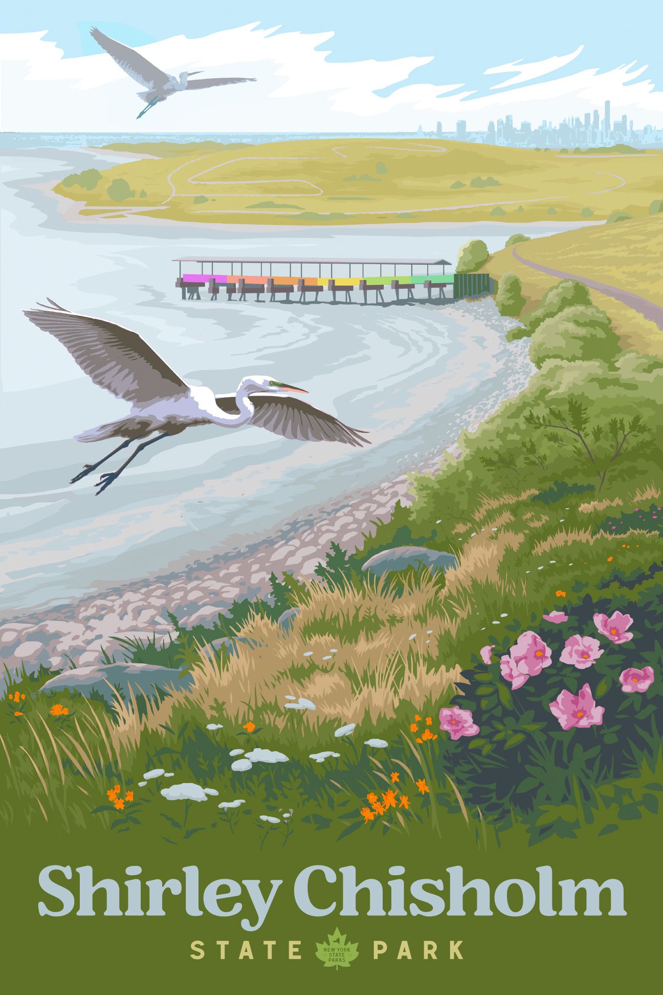
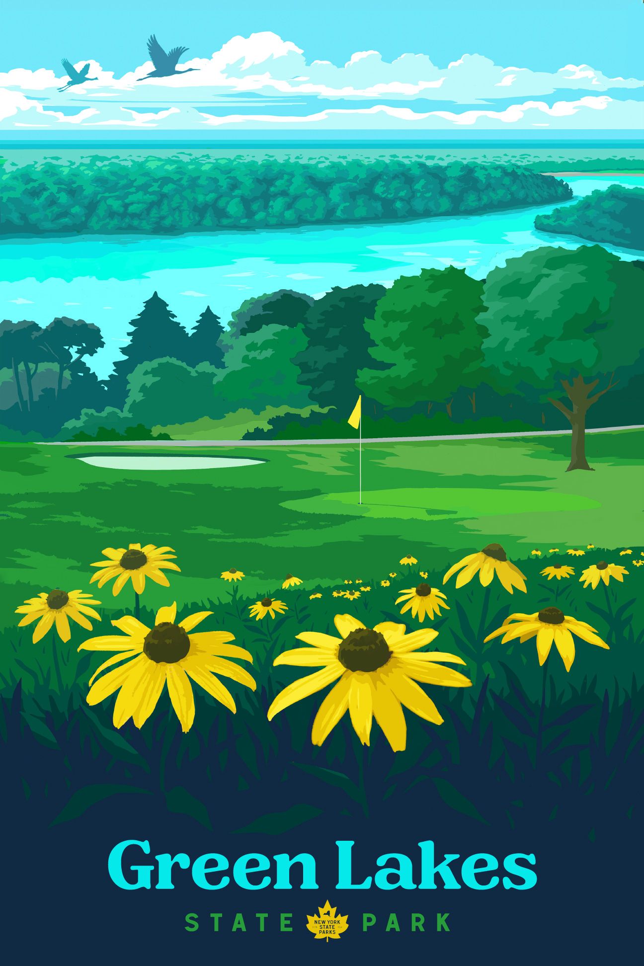
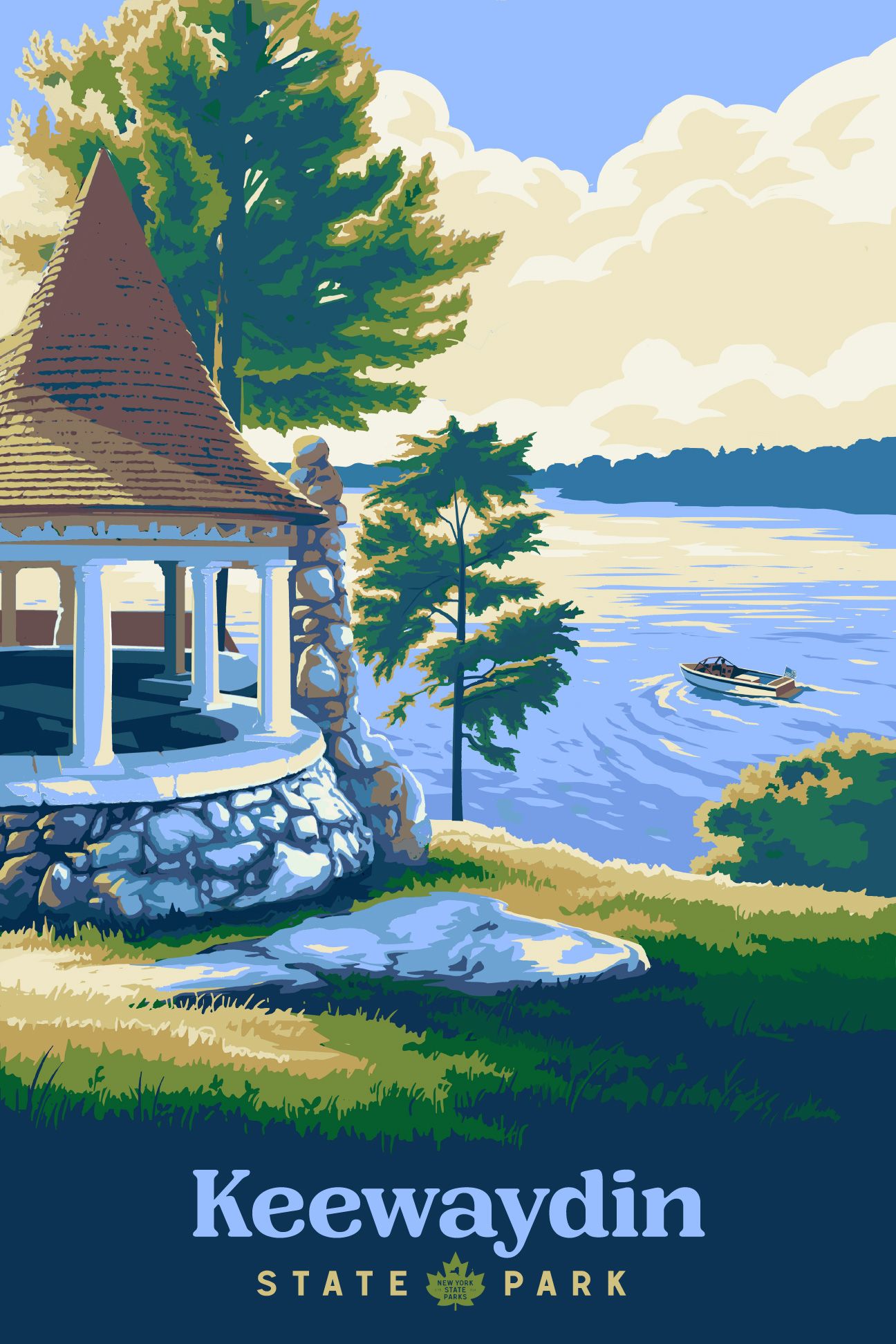
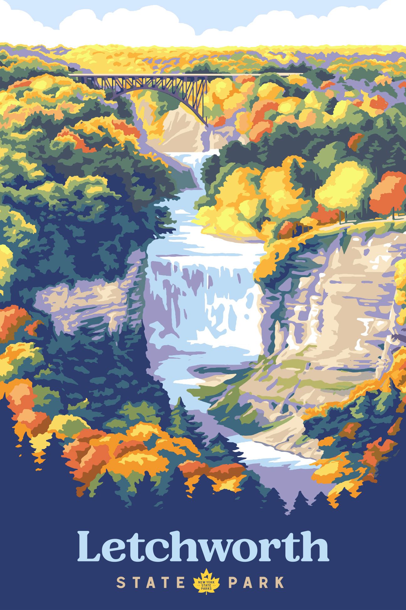
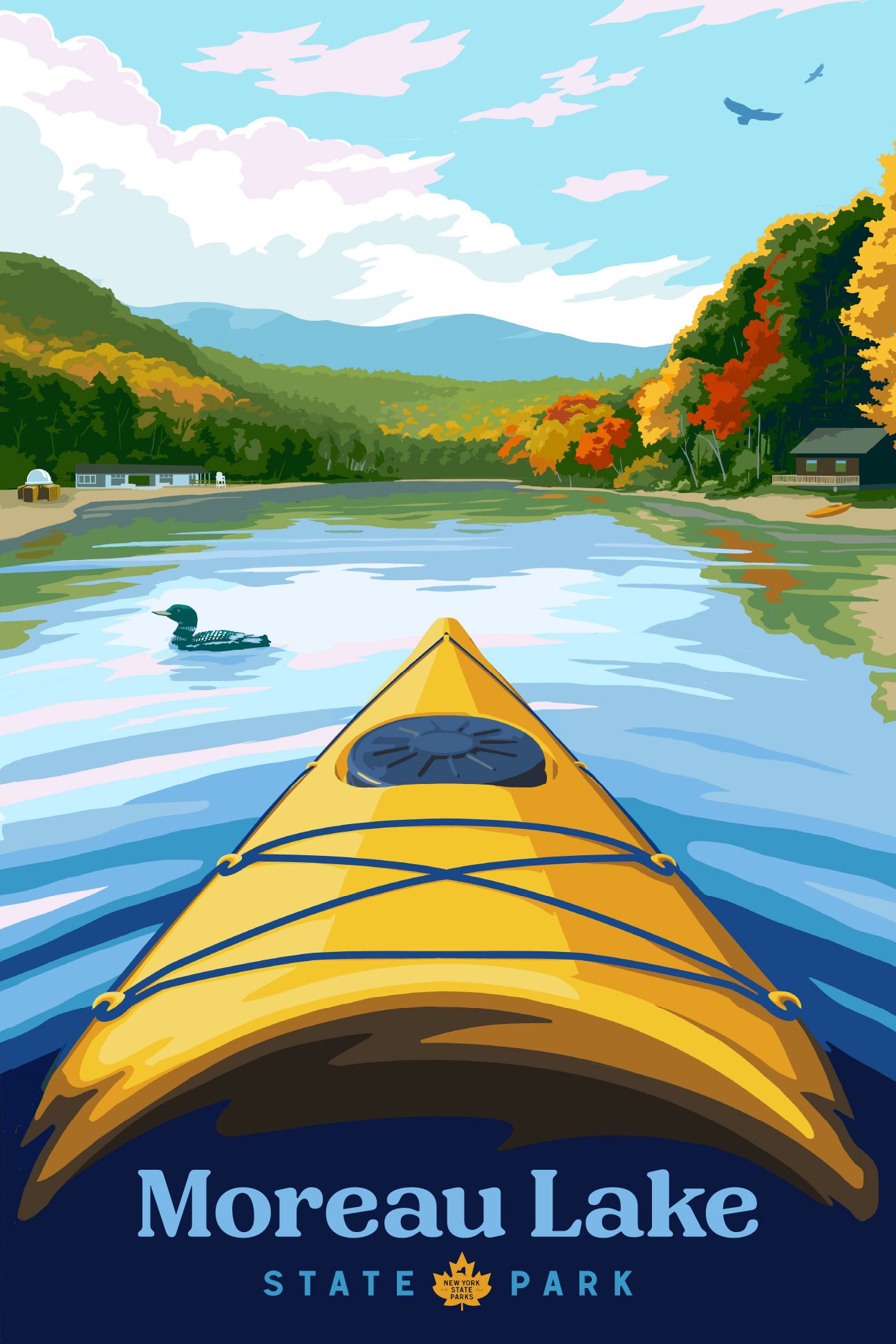

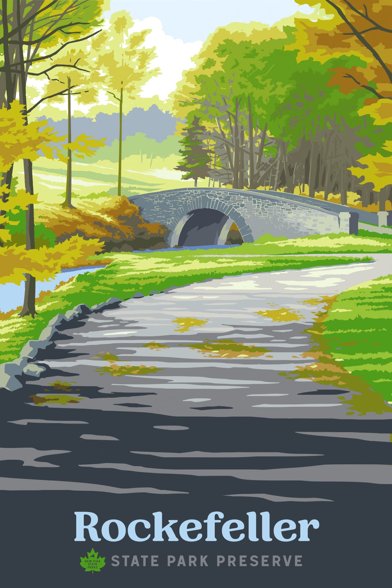

A NEW TYPEFACE
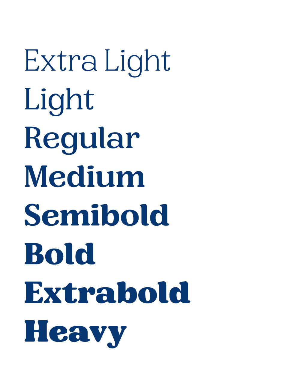
I wanted to create a distinctive attitude for all the elements in this project, and knew original typography would play a major role in that effort. I worked with type designer Tyler Finck, from Etcetera Type Co. in Ithaca, NY, to craft a new variable face for NYS Parks. The new letterforms feature soft and approachable serifs and evoke a feeling of nostalgia, as many state parks do for those who visit.

NYS PARKS MERCHANDISE DESIGN
The new mark needed to be flexible and visually strong enough on its own for various branded merchandising opportunities—both for the NYS Parks organization and individual parks themselves.


HARRY POTTER & THE DEATHLY HALLOWS :: SCHOLASTIC INC., NYC
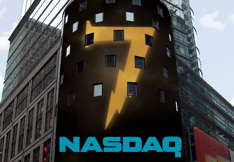
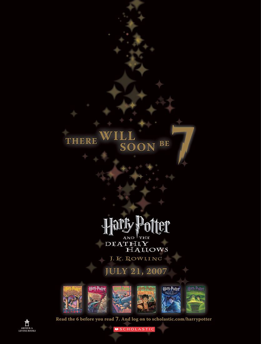
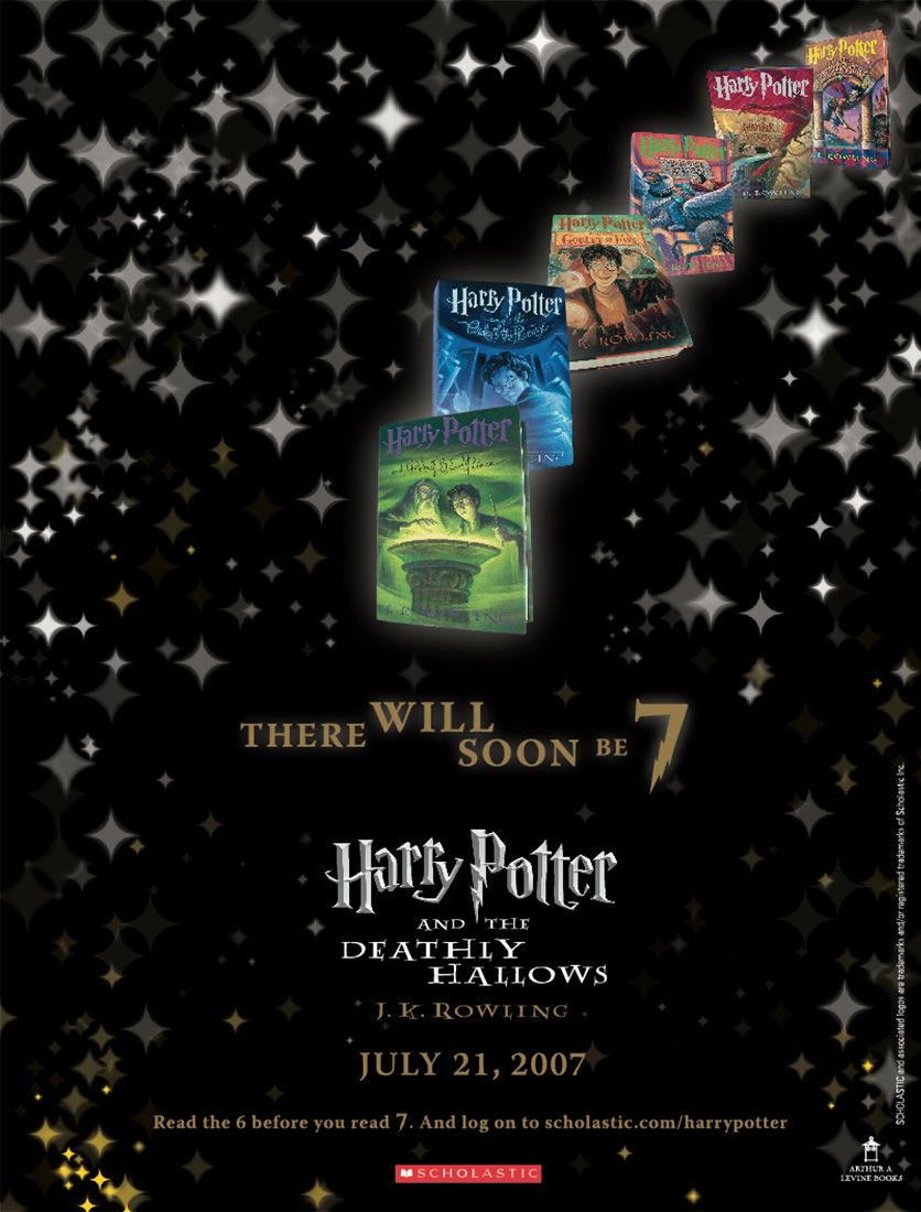
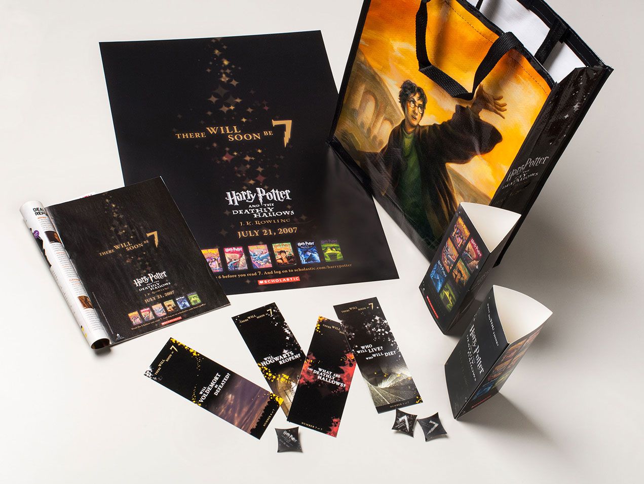
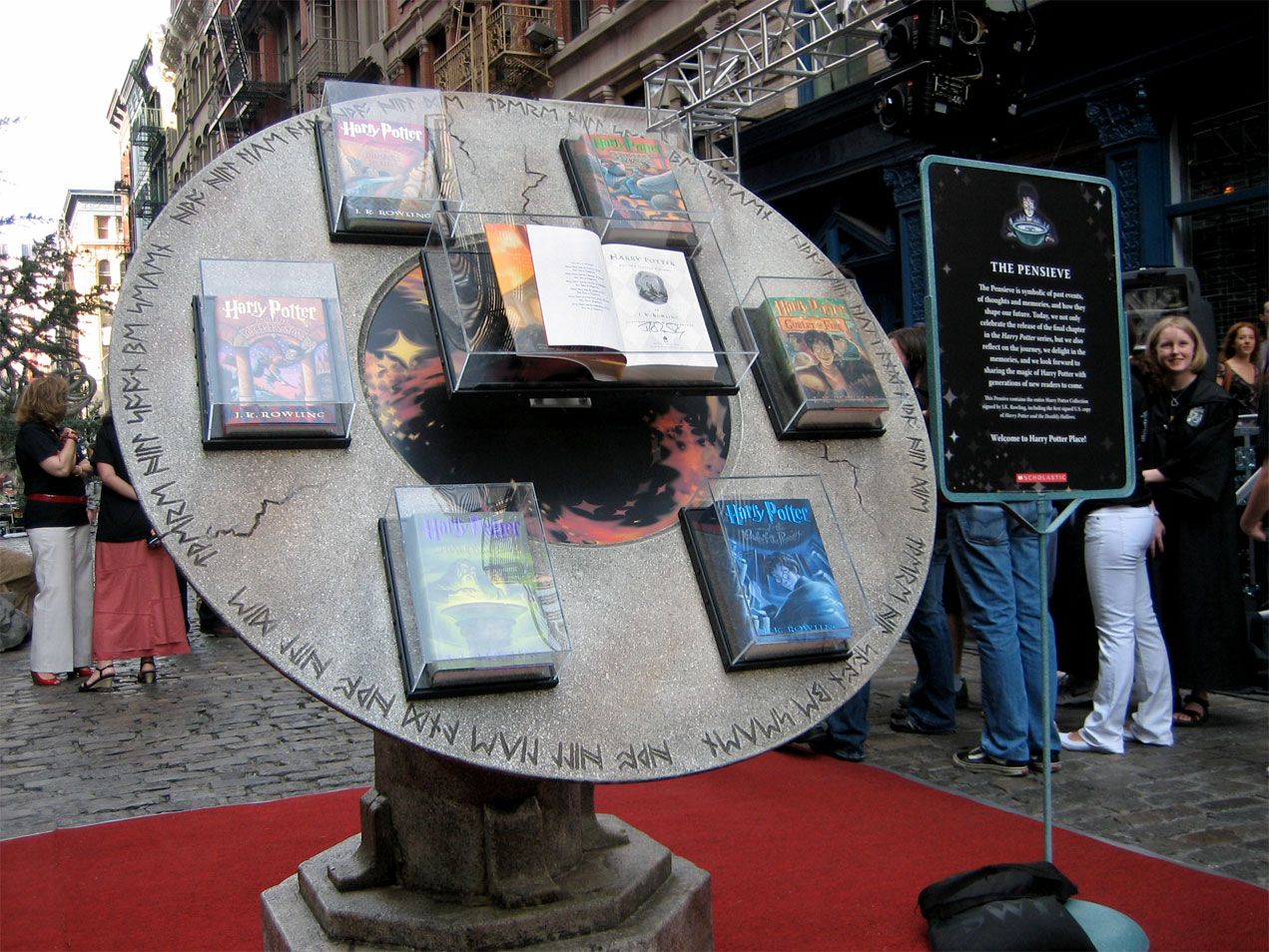
Harry Potter and the Deathly Hallows: The final installment of the Harry Potter series—one of the most highly anticipated books of all time—was fueled by id29. It’s a good story, please bear with me for the abridged version:
Scholastic’s creative director calls and asks if we can be in NYC the following day. Speaking in an unusually hushed tone, he reveals that he has a big project that we might be interested in. He mentions a 7th book, something about a boy wizard with glasses, the importance of absolute secrecy and rather large expectations.
We show up Scholastic’s HQ the next day at 11am. Top management is there, as is their rather serious legal counsel. They explain that they need some extra special secret sauce to fuel the integrated campaign for the final Harry Potter book, and ask if we would like to be part of a paid project to provide creative and non-traditional media strategy. They also reveal that we’re up against four of the world’s largest, most capable agencies. Oh, and we have 1.5 weeks to impress them.
A week and a half later, we show up at Scholastic once again. We walk them through our work, our strategy and our vision. We leave knowing that our work is up against agencies with virtually unlimited resources and fame compared to ours. Less than 24 hours later, we get the call. We got the job. For the next seven months, we executed our creative and nearly every element of the marketing plan. Big project. Small agency. Great fit. The results? 8.3M books sold in the first 24 hours.
I worked closely with id29 Senior Designer, Bryan Kahrs, on this project, as he set the initial visual aesthetic that was chosen by Scholastic.


COBRA PUMA GOLF :: CARLSBAD, CA
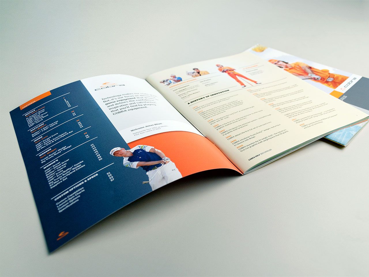
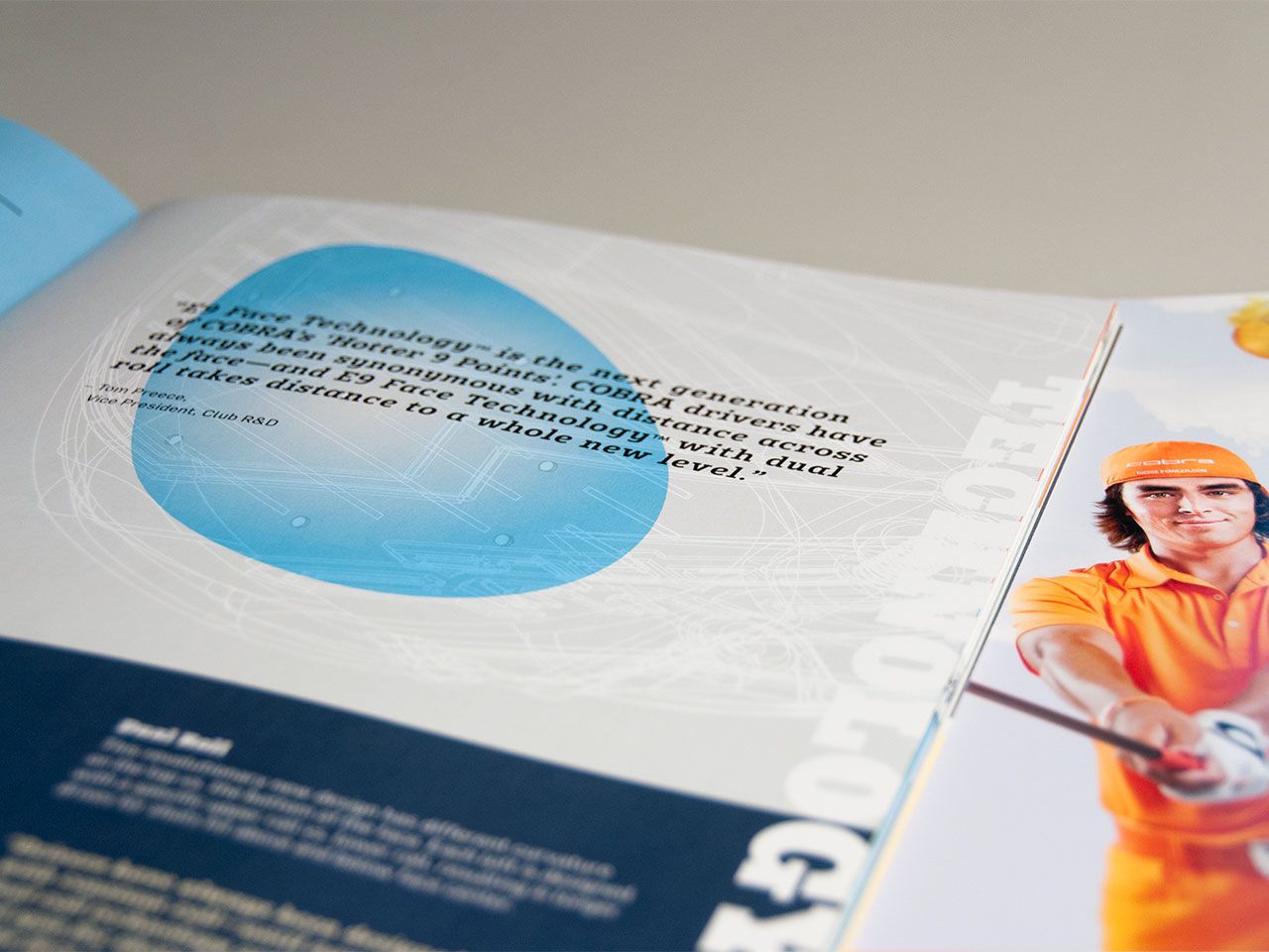
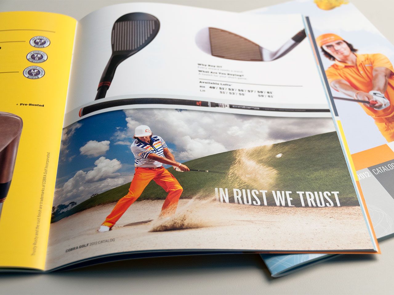
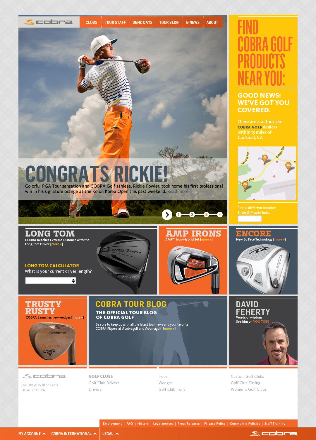
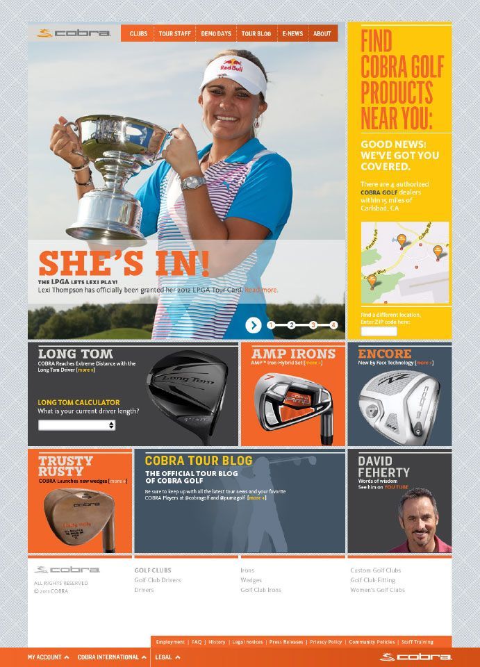
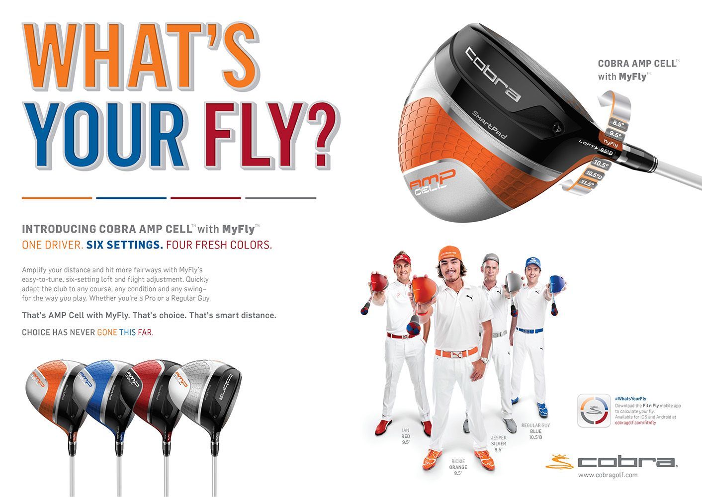
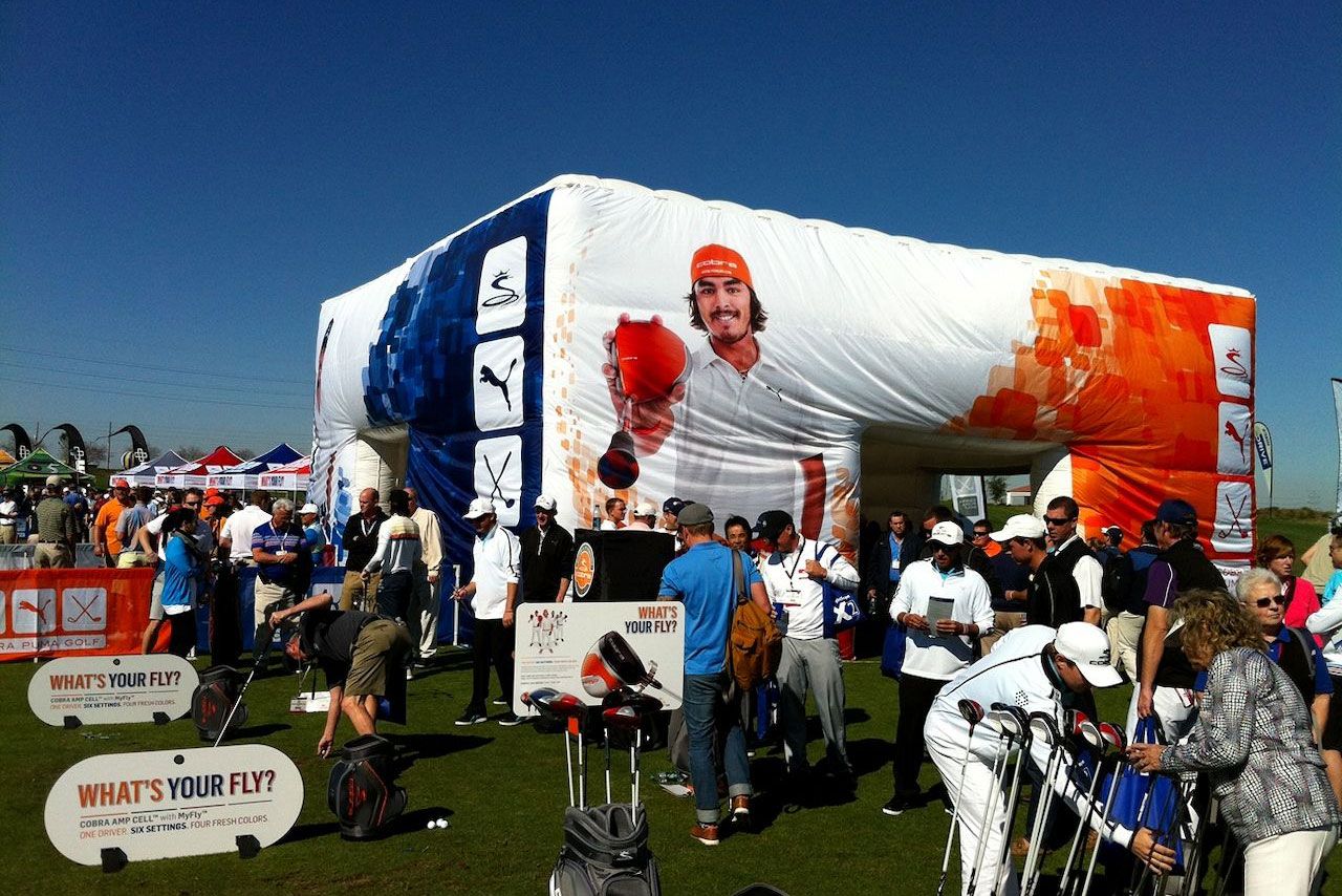
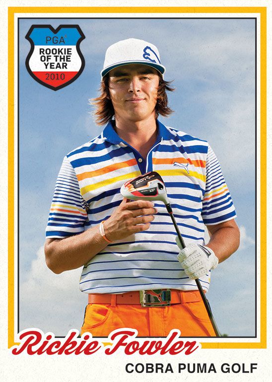
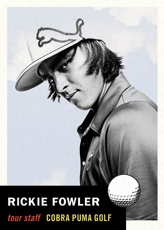
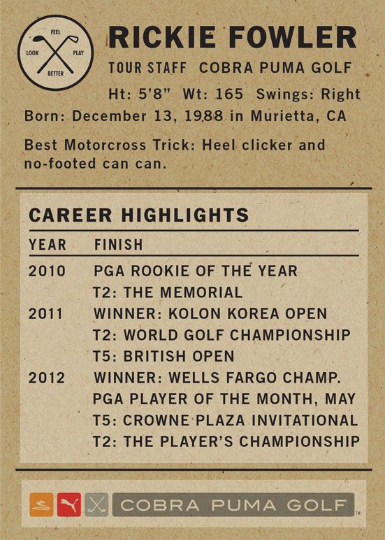
Cobra Golf had just been aquired by PUMA, and asked id29 to help them reposition and relaunch their brand in 2011. The golf category was stagnant at best and Cobra’s market share had declined considerably. Consumer participation and purchases had slowed. In most countries, the pie wasn't getting any larger, so market share gains had to be taken from competitors.
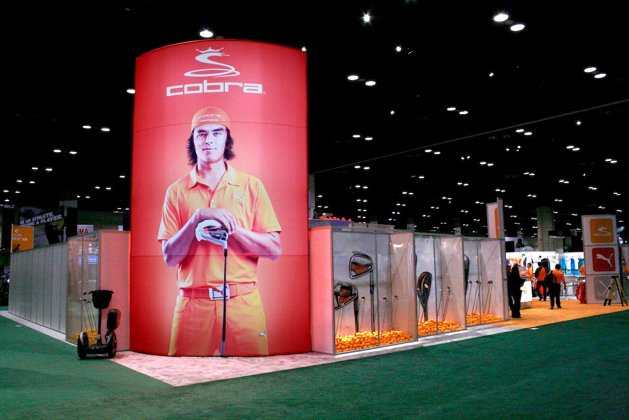
100' x 60' PGA Show booth design for Cobra Puma Golf in Orlando, FL
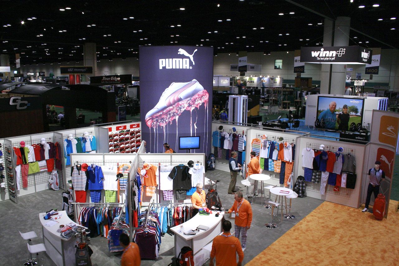
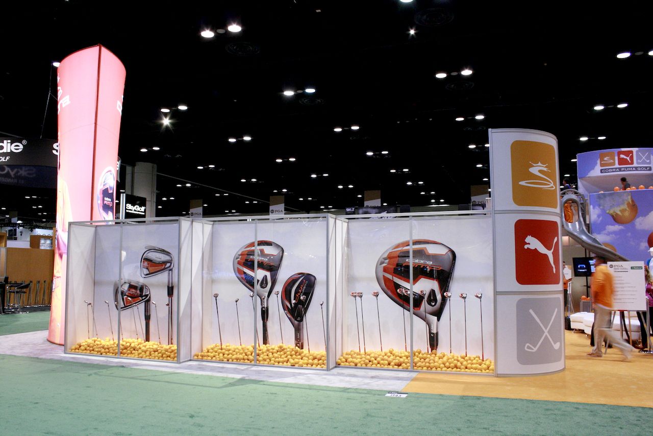
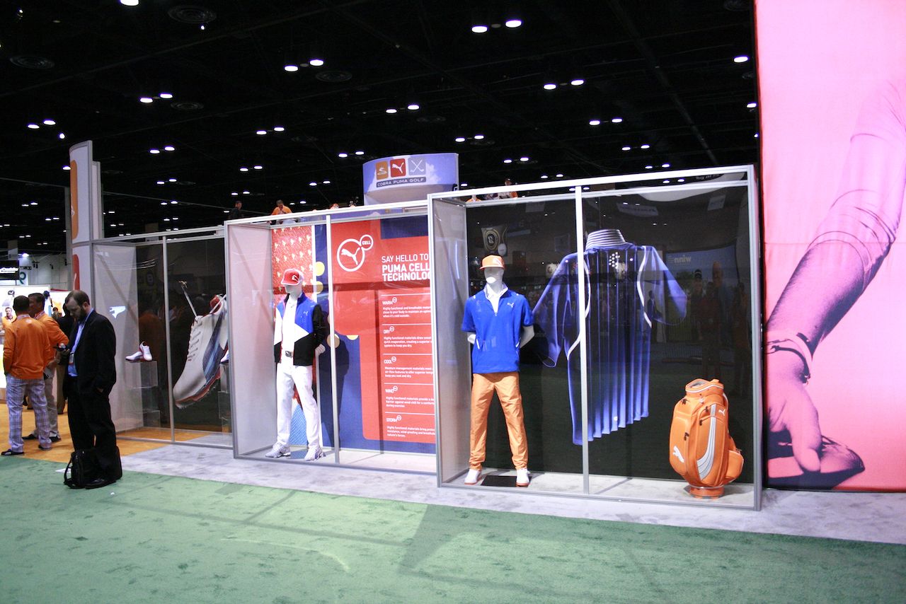
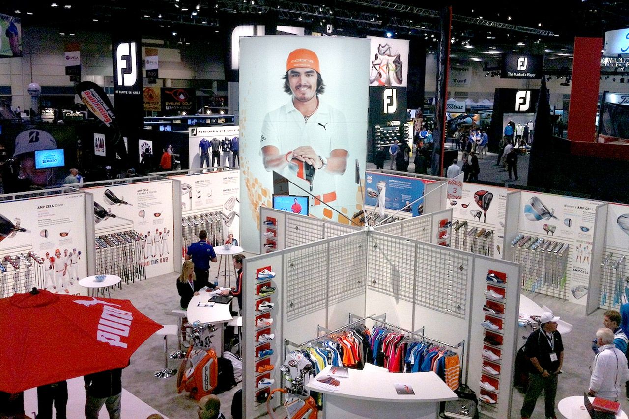



COBRA PUMA GOLF BROADCAST VIDEO

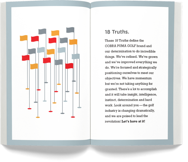
PROMOTIONAL BOOKS
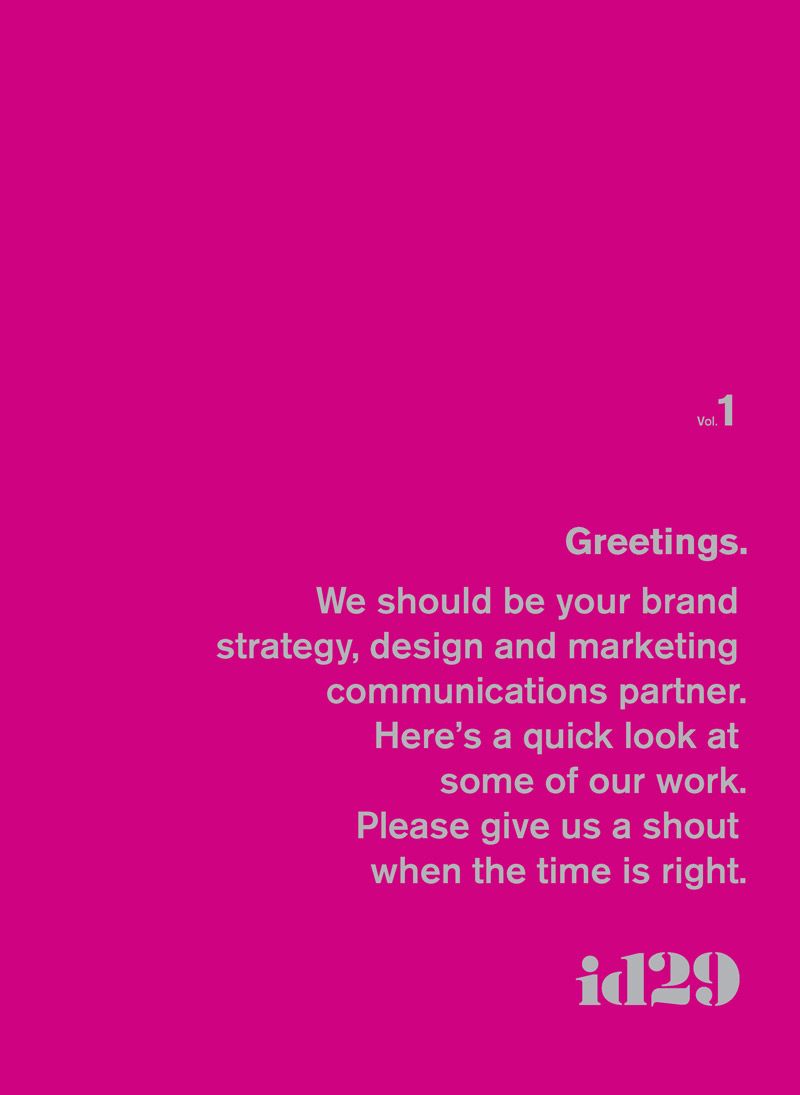
We letterpressed these oversized covers with silver metallic ink on bright, colorful cover stock and saddle-stitched the slightly-smaller pages inside. I designed these books and a lot—but not all—of the work inside.

BESTPASS :: ALBANY, NY
Bestpass—the country’s leading toll management solution for truck fleets and owner-operators—came to id29 with very aggressive growth plans and a brand in disarray.
They understood the need to have a solid strategic foundation prior to doing any creative brand work. So, the first few months of our partnership focused solely on iteratively evaluating, exploring, articulating and documenting the strategic guideposts for the brand. That work resulted in a focused and intelligent approach to their new brand identity, campaign creative, photography, website, video, content and media planning.
In the first full year after the launch of the new brand, media plan and marketing communications, they were crushing their growth plans. We were proud to be their agency of record and to work with them each and every day.
-
Previous logo
New mark
A new brand ID that could stand alone with strength or be used as an unobtrusive accent across their communications.
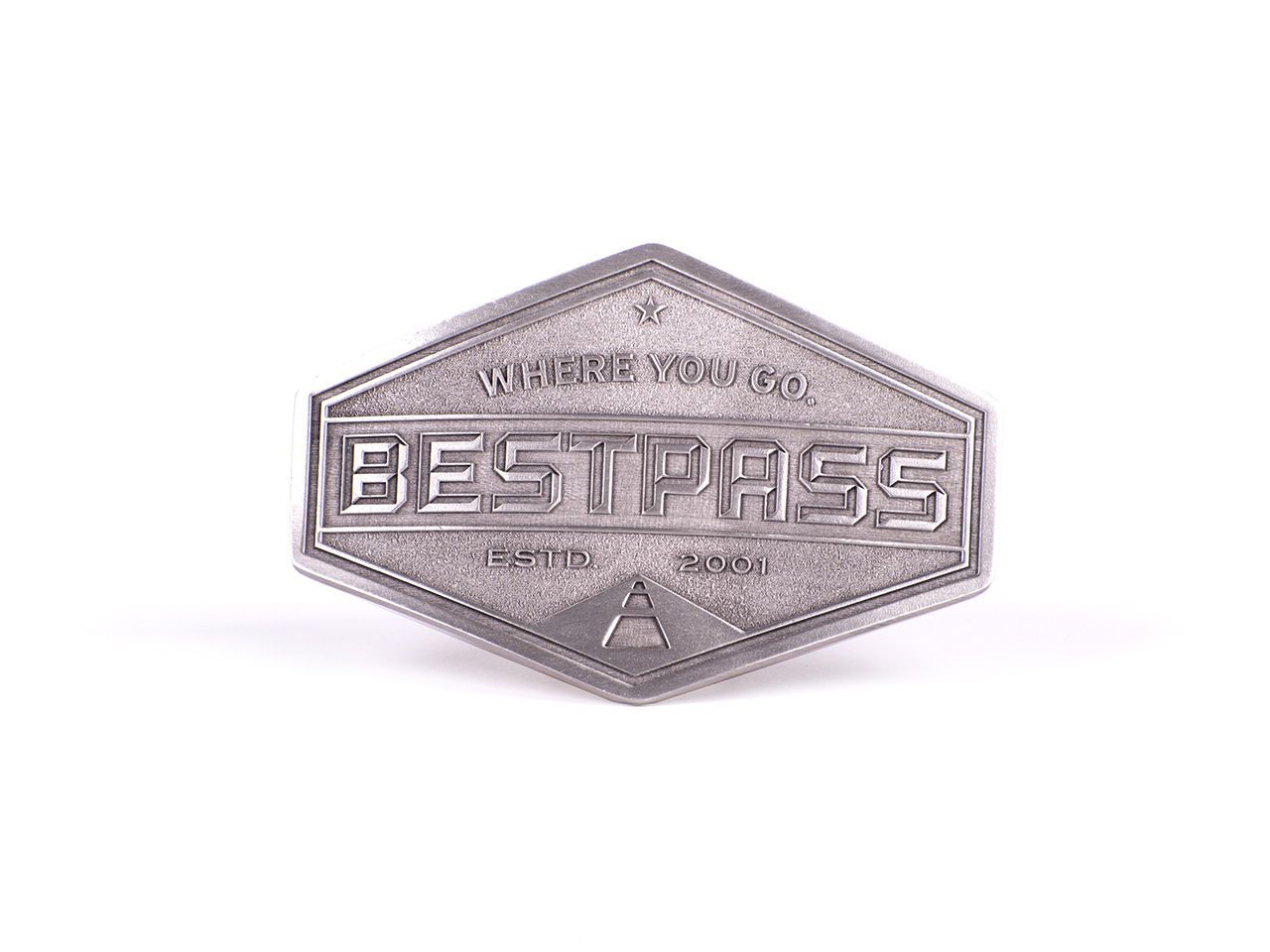
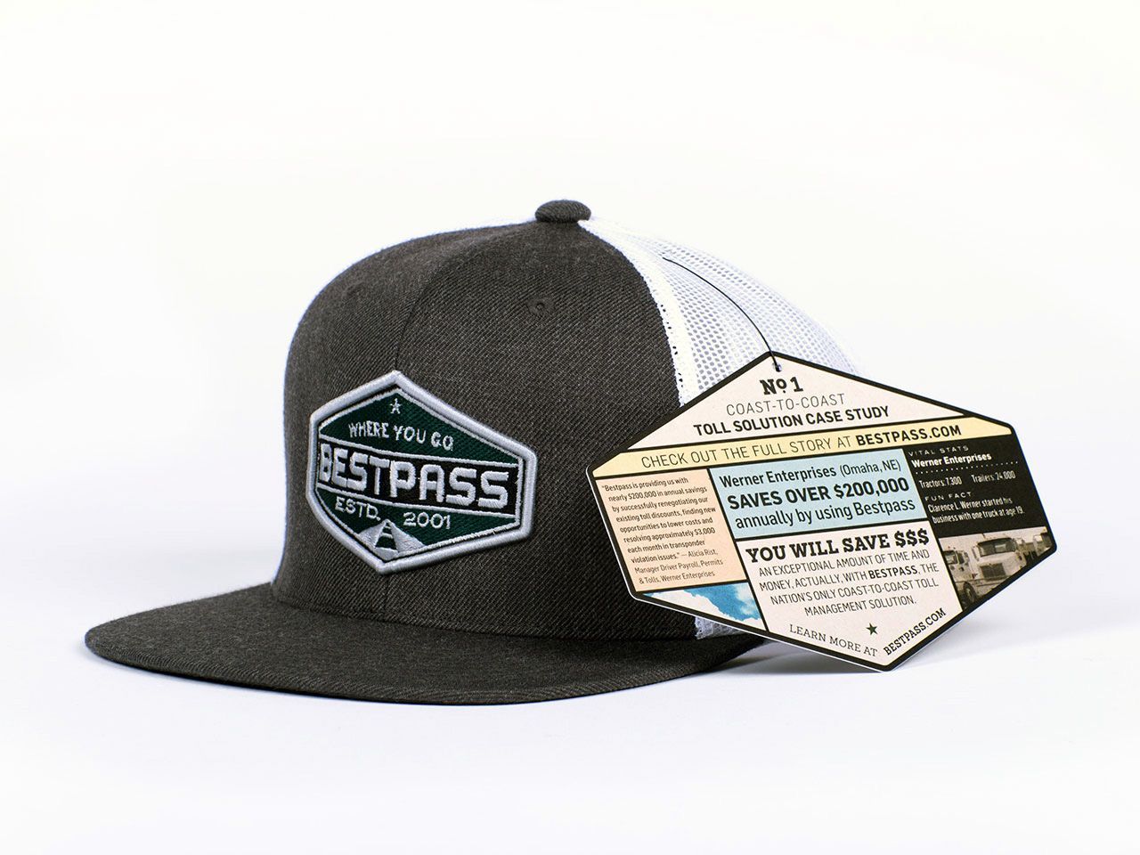
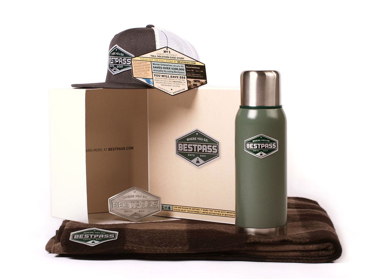
BRAND PROMOTIONAL SWAG
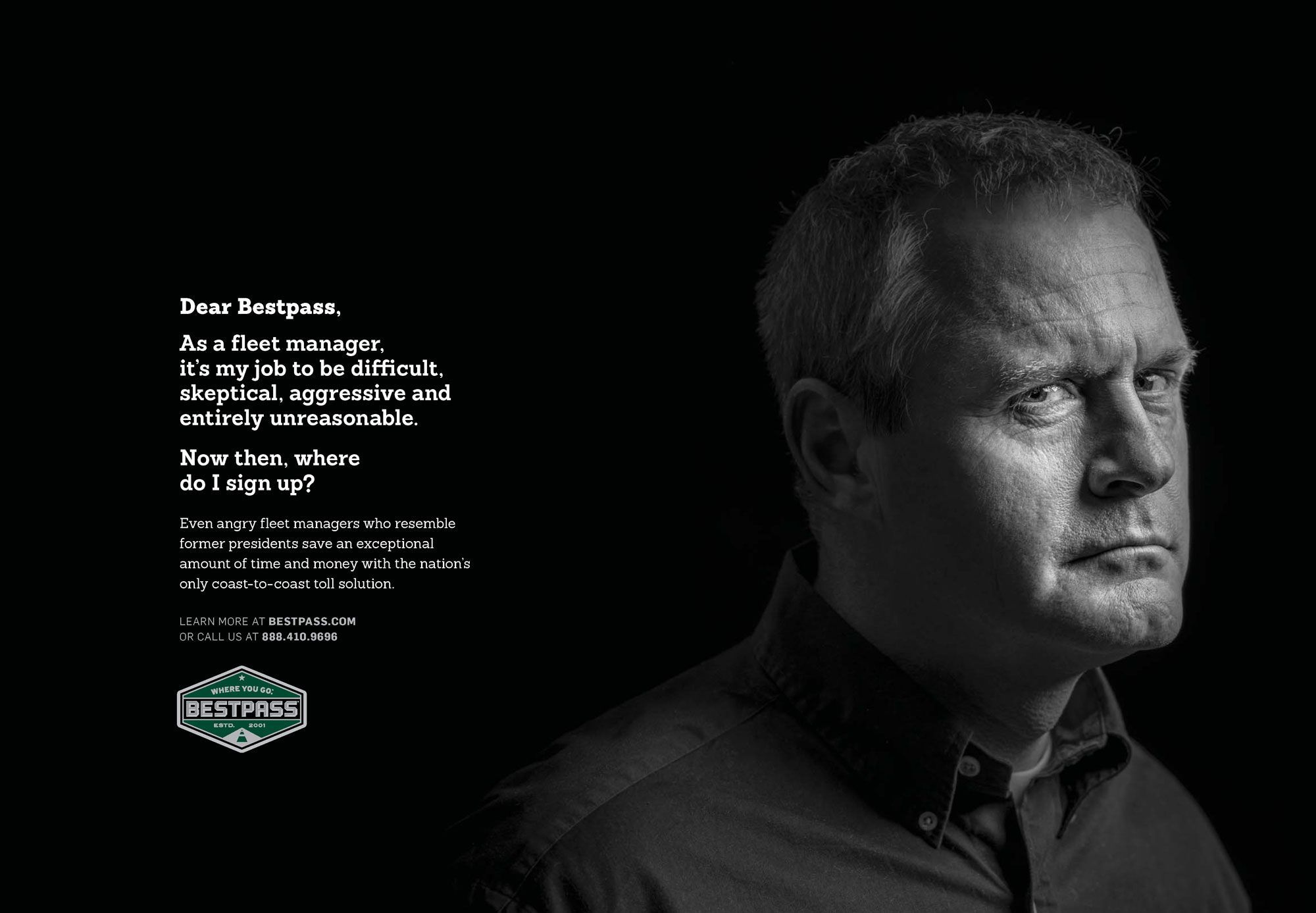
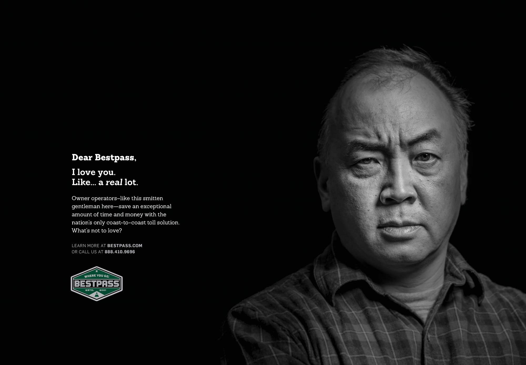
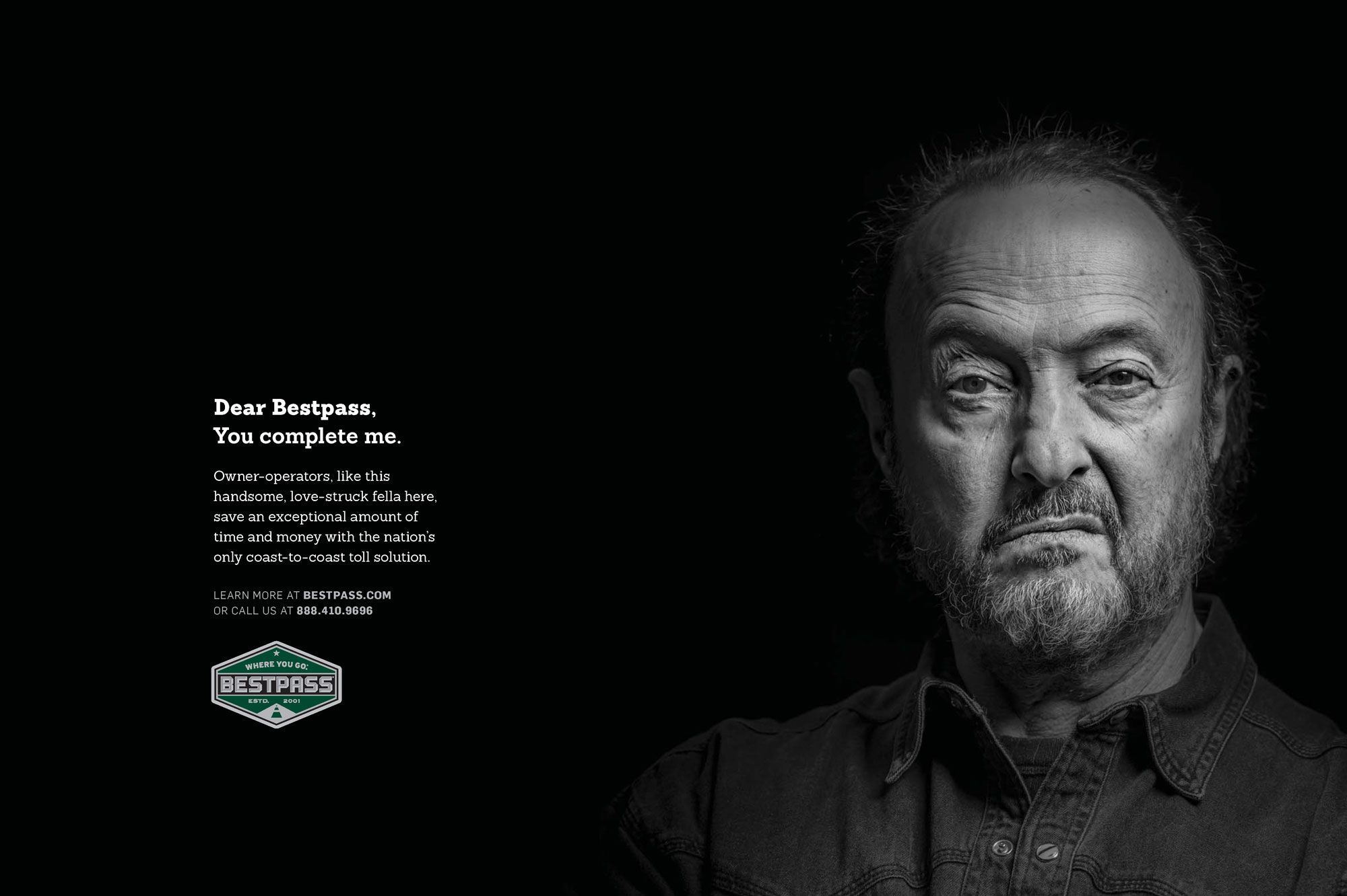
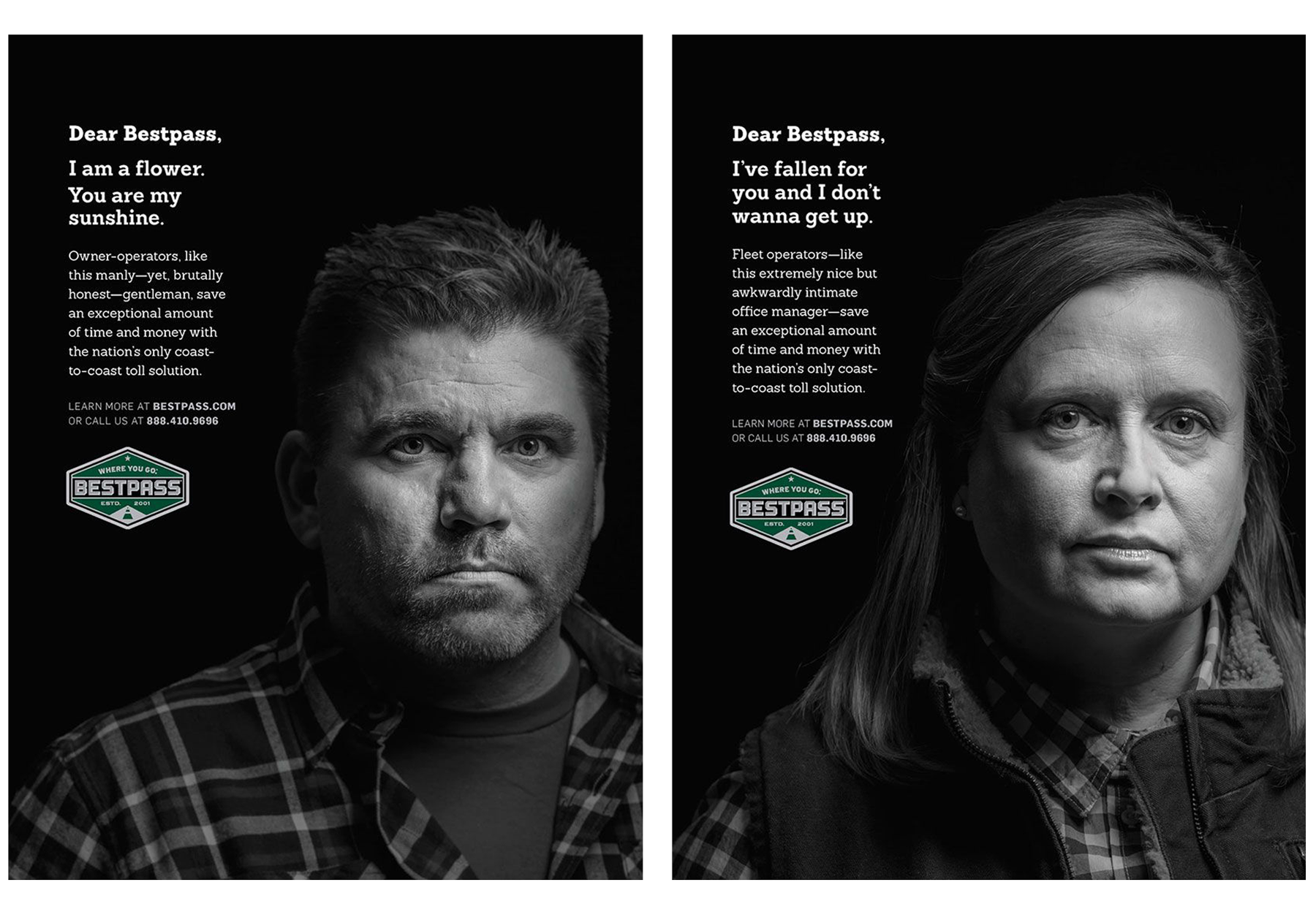
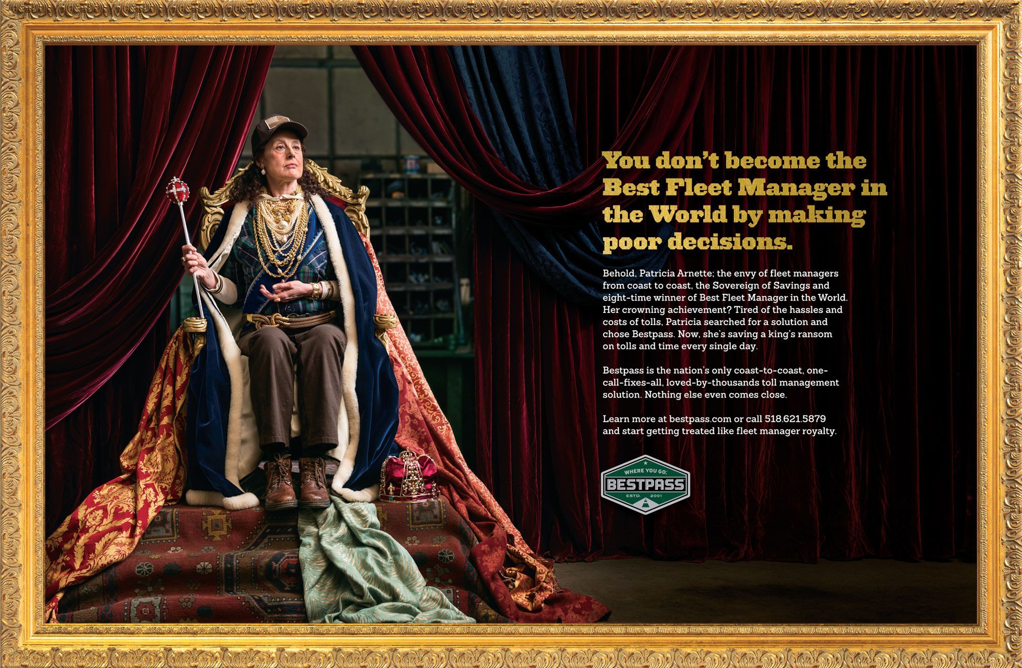
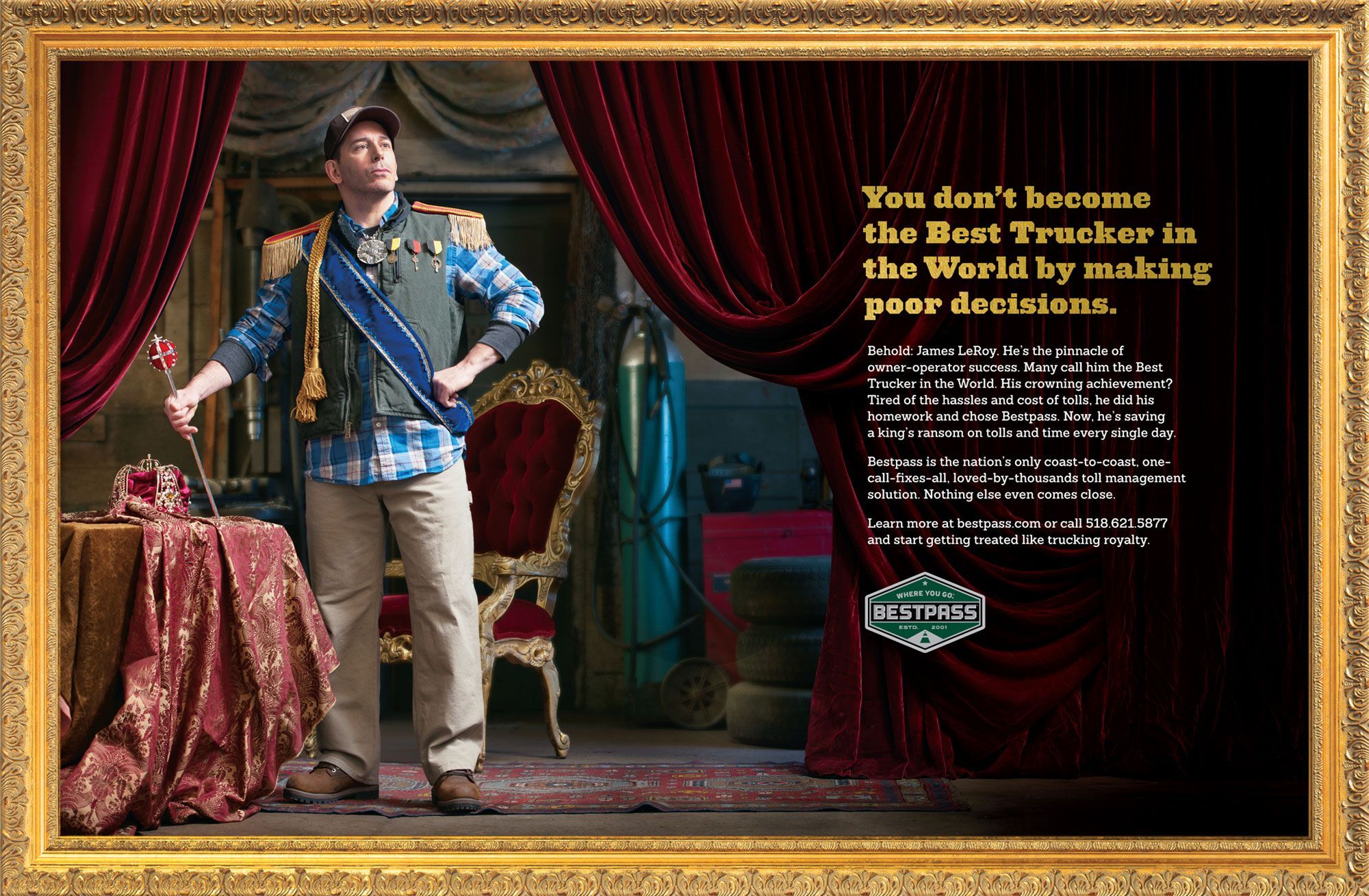
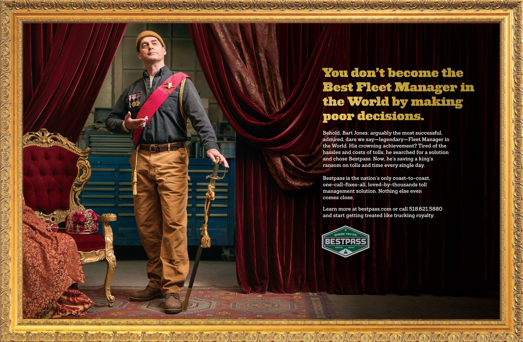
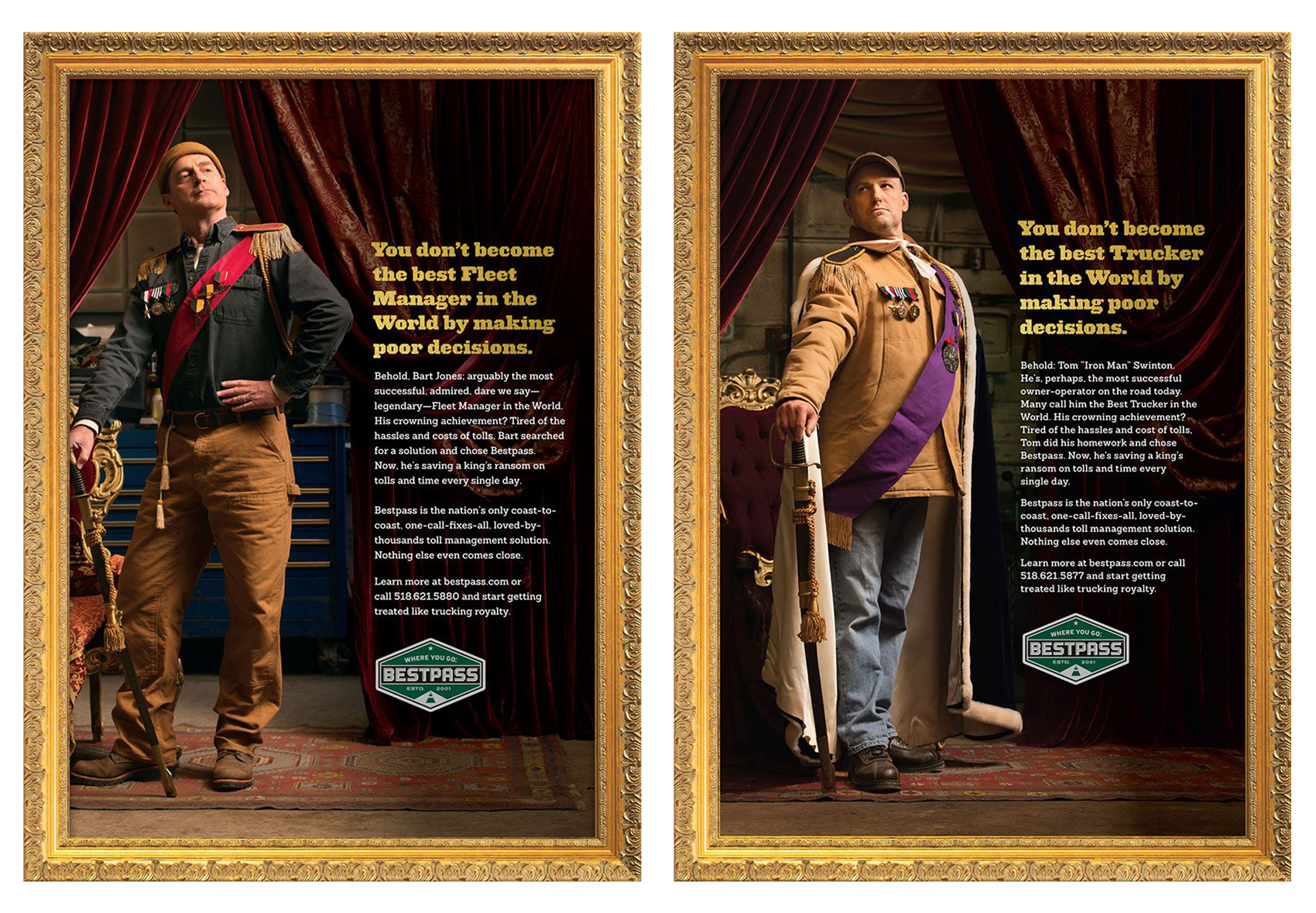
NATIONAL AD CAMPAIGNS

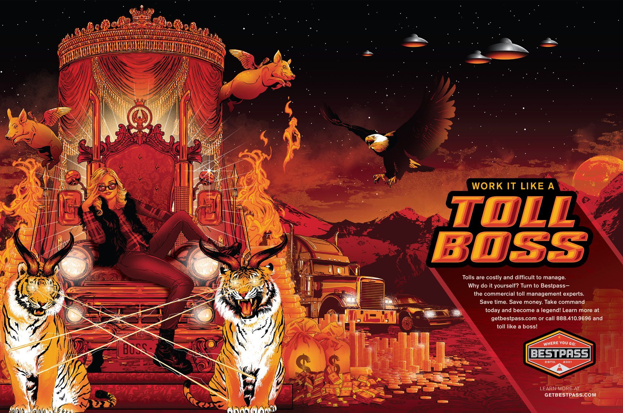
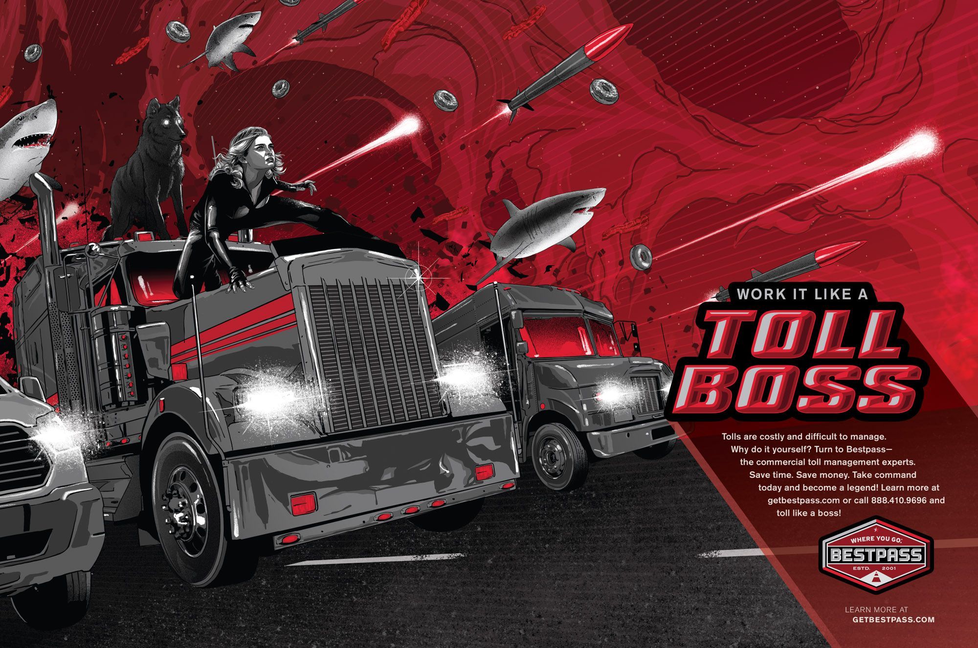

EMPAC :: EXPERIMENTAL MEDIA AND PERFORMING ARTS CENTER AT RENSSELAER
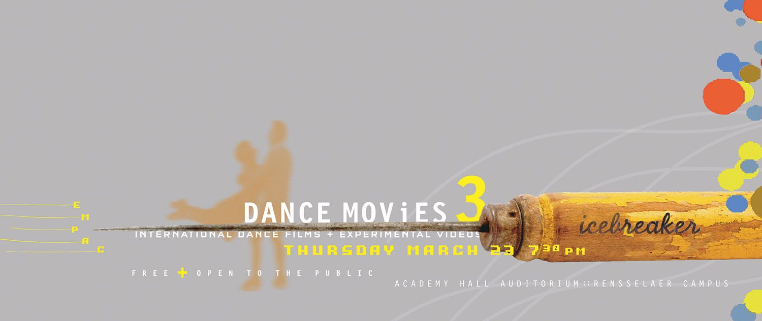
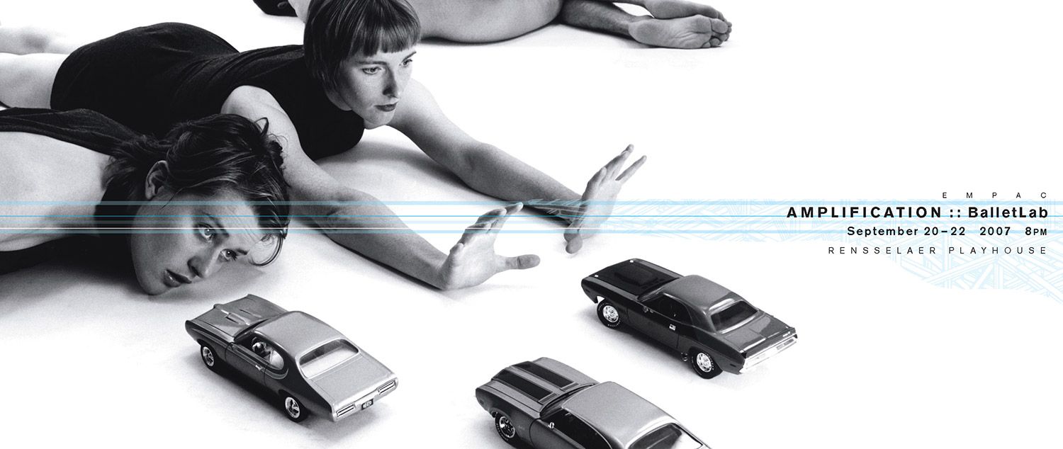
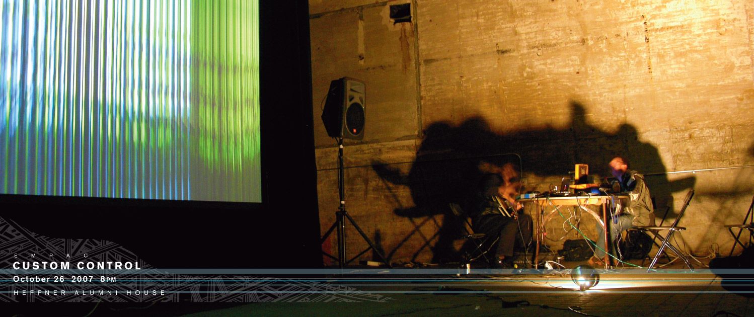
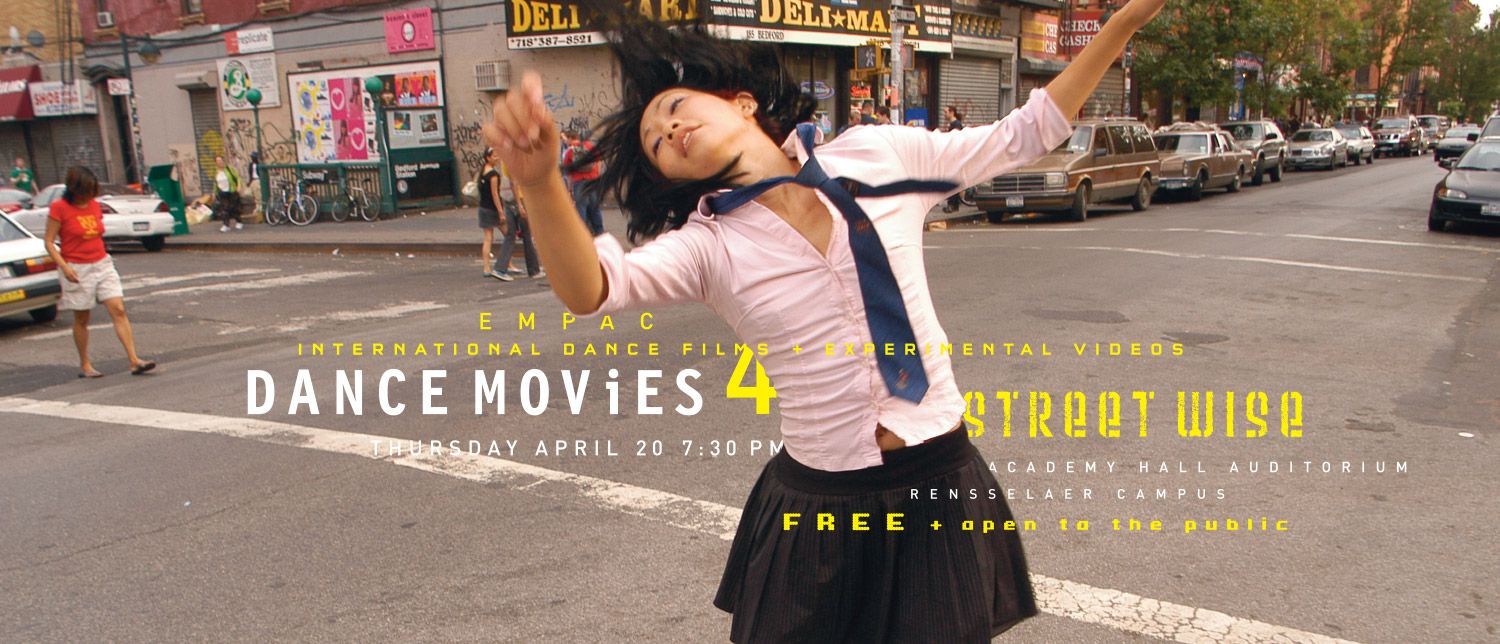
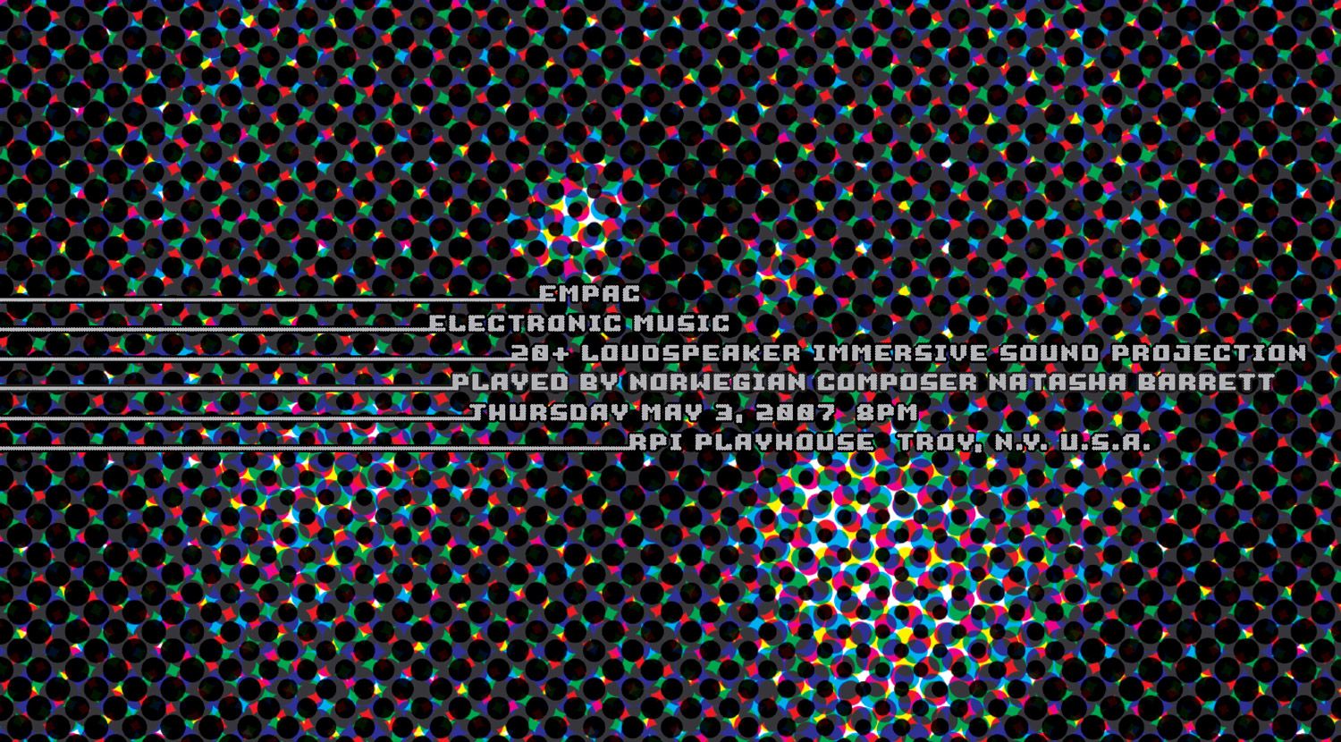
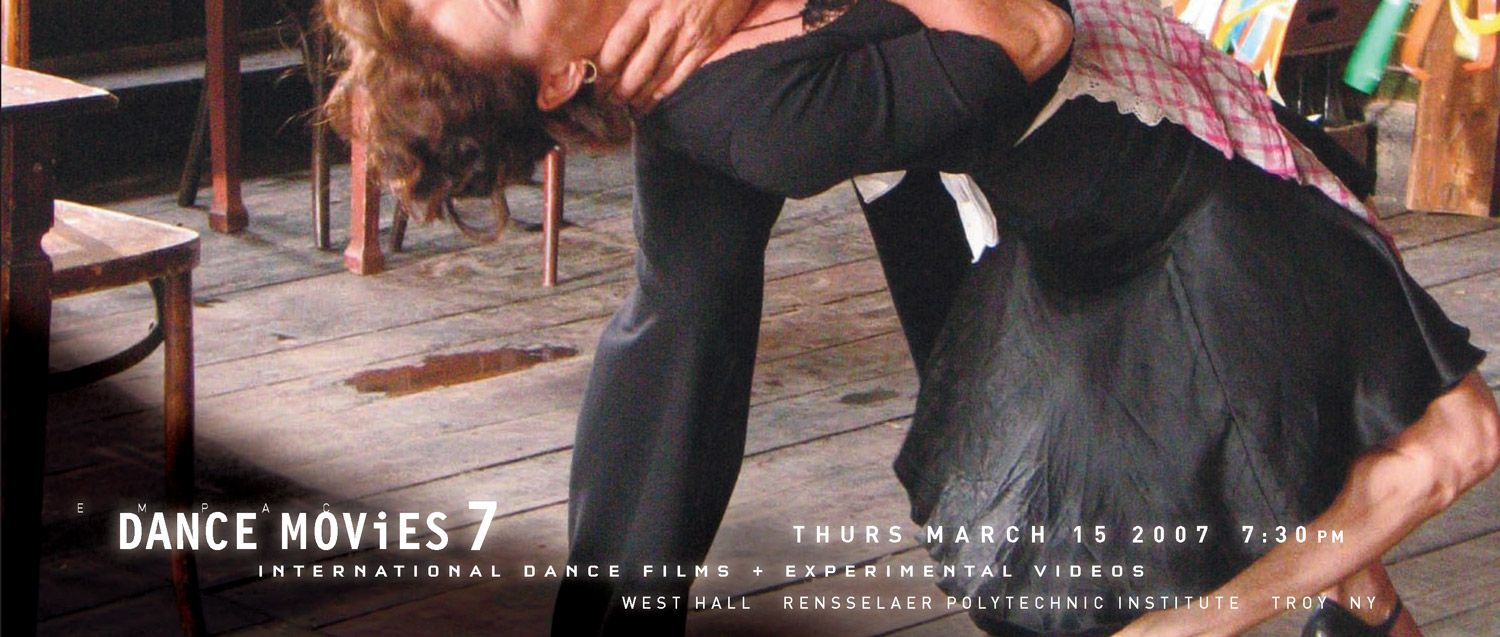
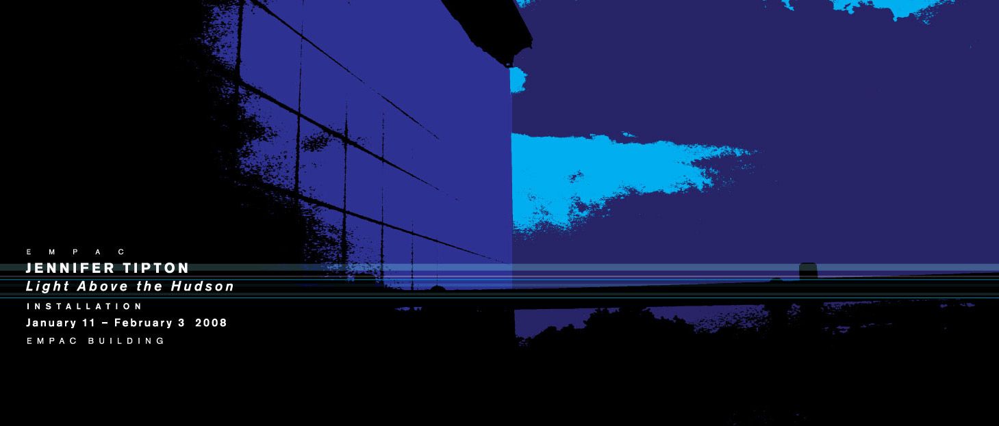
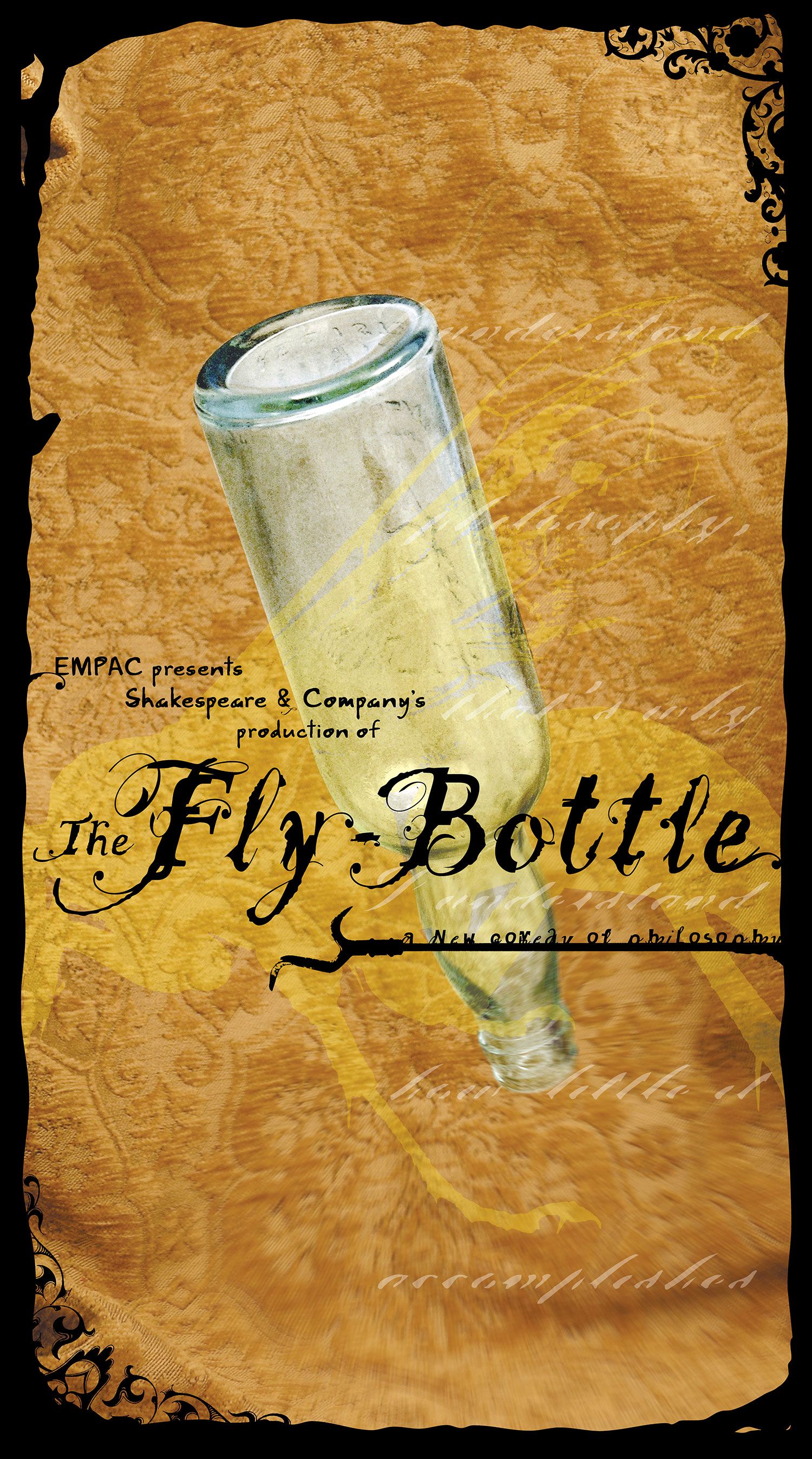
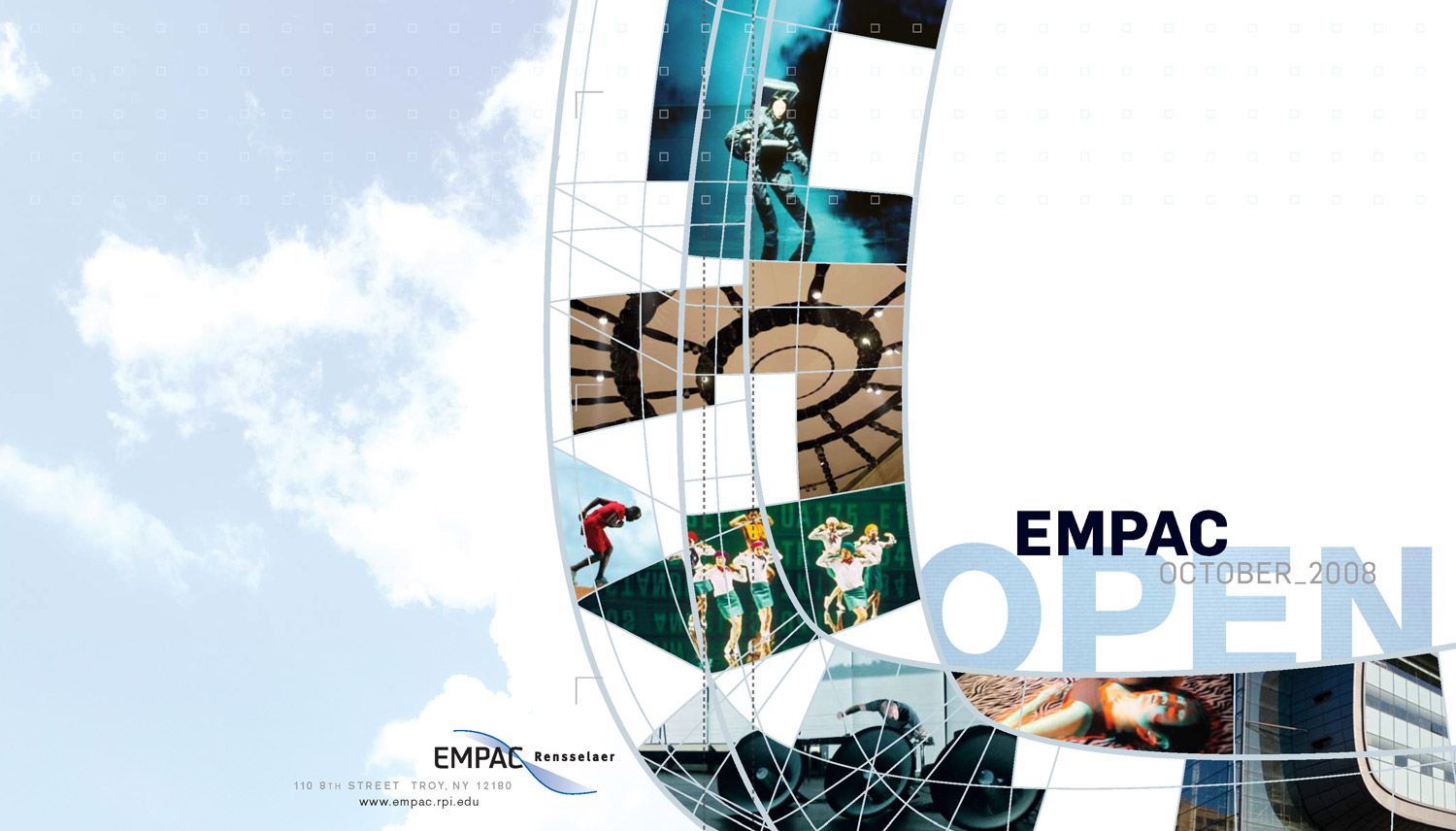
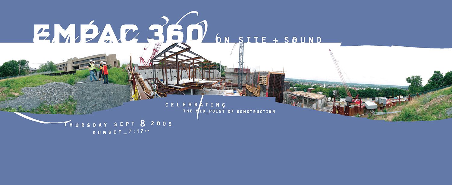
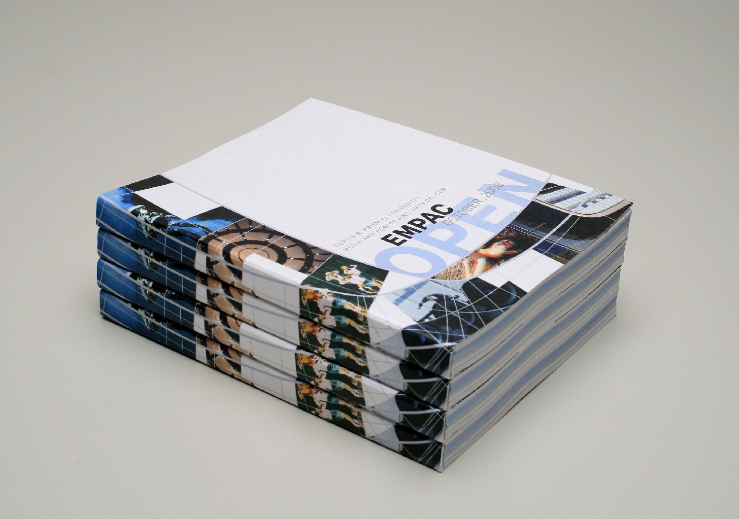
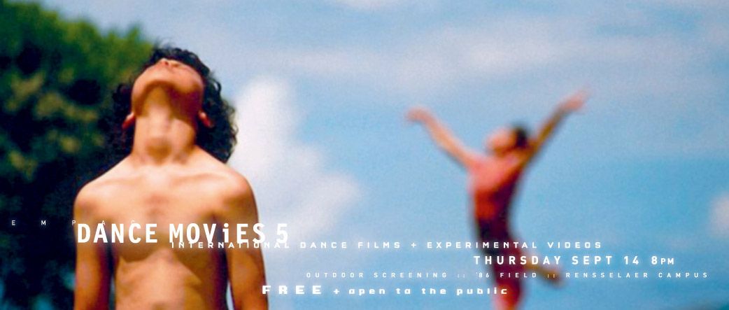
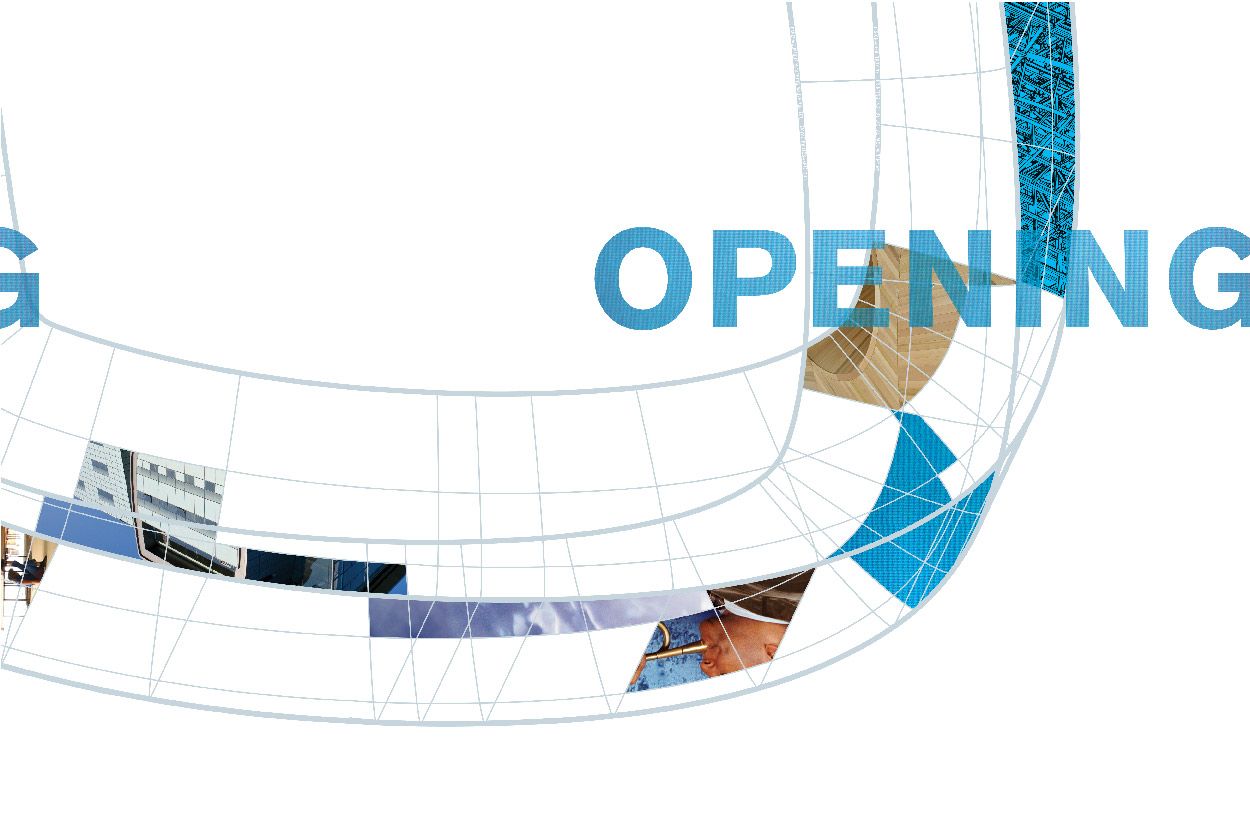
Acoustically, it’s considered one of the most perfect venues in the world. Architecturally, it’s a stunning, Grimshaw-designed, amalgam of glass, wood, steel and technology, perfectly perched on a riverside slope. It’s EMPAC (Experimental Media and Performing Arts Center) in Troy, NY. id29 was jazzed to be a part of such an ambitious, world-class venue, we helped them establish a design-driven presence and introduce themselves to the world.

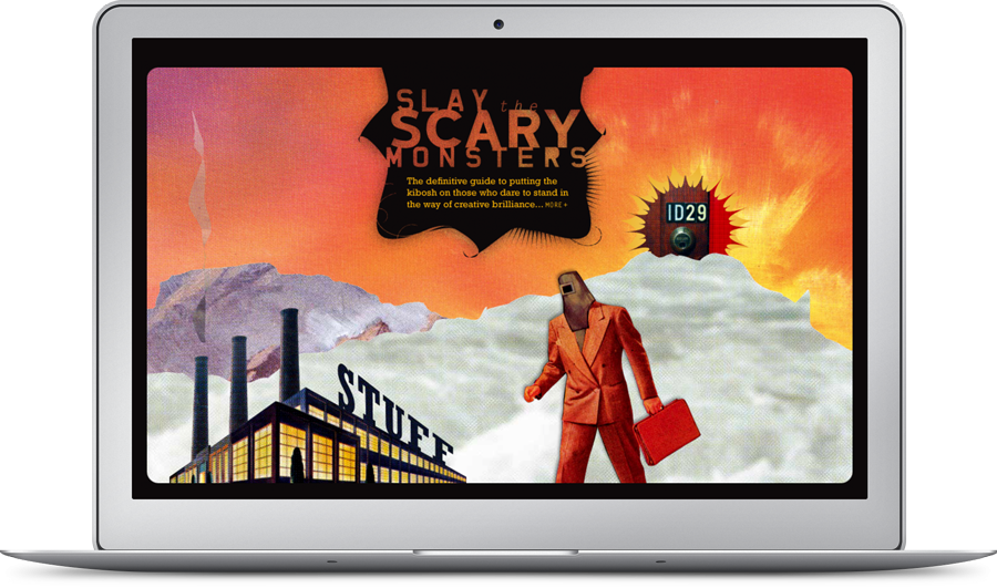
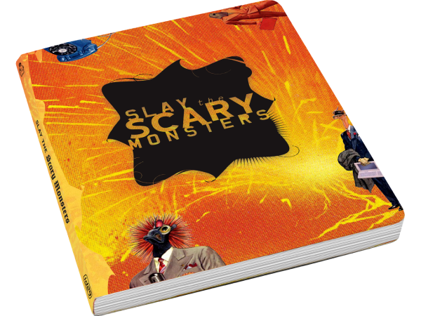
SLAY THE SCARY MONSTERS :: SELF-PROMOTIONAL CAMPAIGN
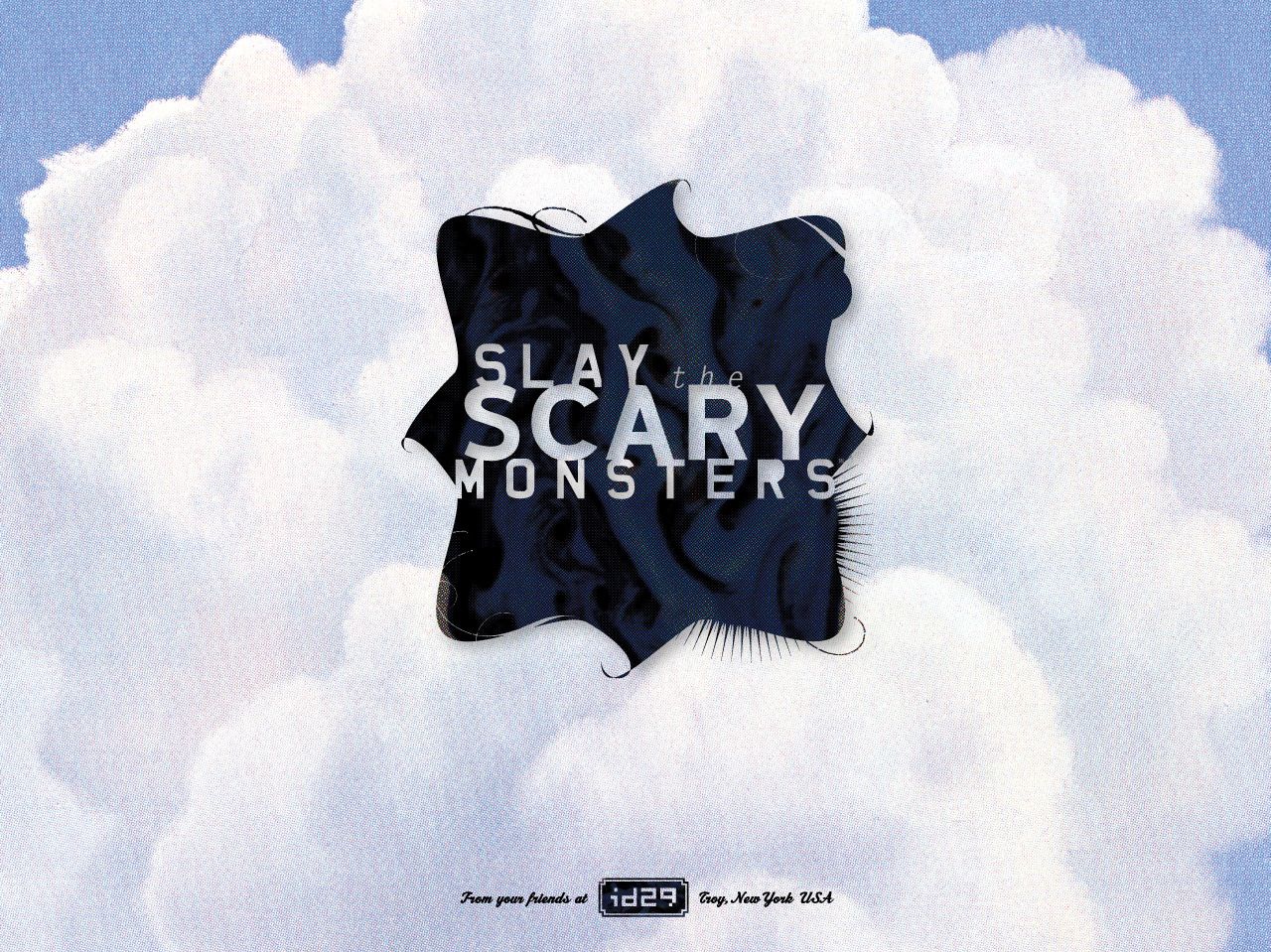
This is id29's story of Scary Monsters: Wicked foes, born losers, obstacles, pain and suffering, massive market downturns, fear, workplace backstabbers, rodents, arbitrary budget cuts, power-hungry yes-men, inept co-workers, promises unkept, ugly competitors, and overripe, overpaid execs who reek of sardines, sulphur and lies—anyone and anything that keeps you from doing your job and doing it well. Ultimately, however, it is an epic tale of battles fought and won.
This is a story of id29, a small yet mighty design, brand, creative and marketing communications studio in Troy, NY. It is a story of their clients and the powerful weaponry id29 will provide to you in your endeavor to Slay the Scary Monsters.

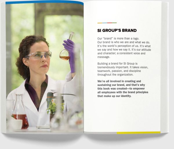
SI GROUP :: NISKAYUNA, NY
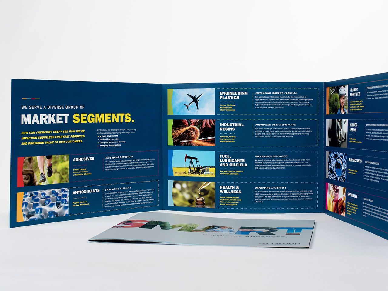
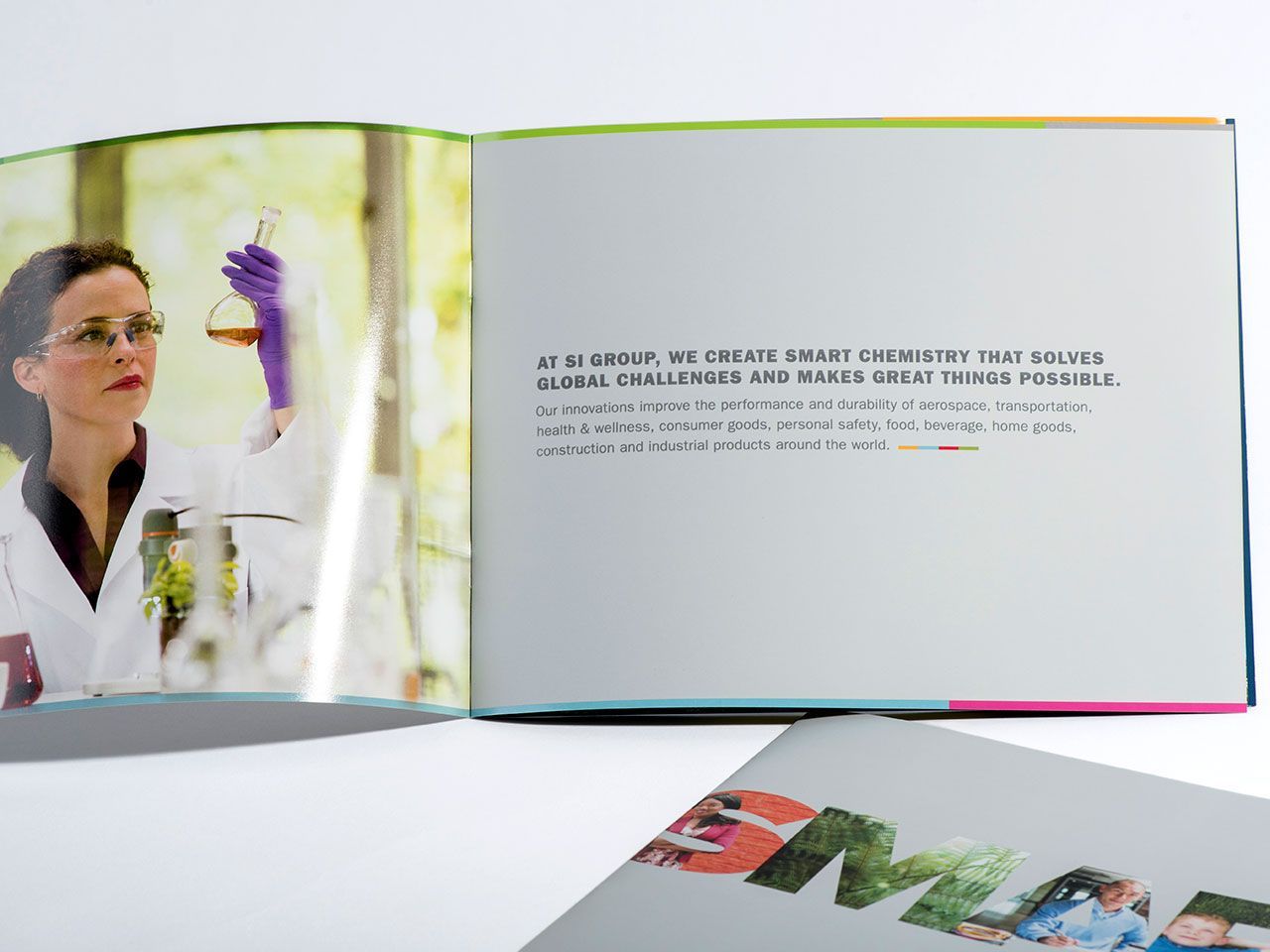
SI Group brought id29 on board because they wanted to work with a company that could help them locally, but had the chops to handle their global needs. Over the course of a few months we engaged in a deep dive on brand strategy. We helped them answer some all-too-difficult questions: Who are you? What are your core values? What services do you provide and to whom? How should SI Group be positioned in the market? What should the SI Group brand convey? In 2015, we created the new SI Group brand and helped them launch what will be very valuable assets for years to come.
-
Previous logo
New mark
A stylized wordmark with brand color bar
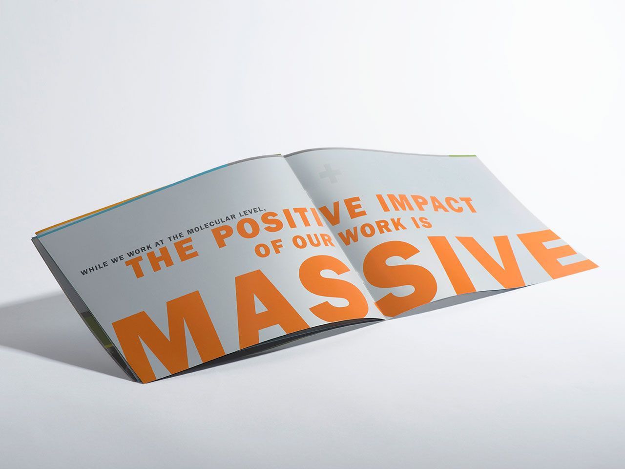
SI GROUP CORPORATE BROCHURE
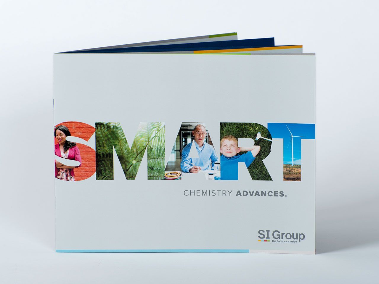
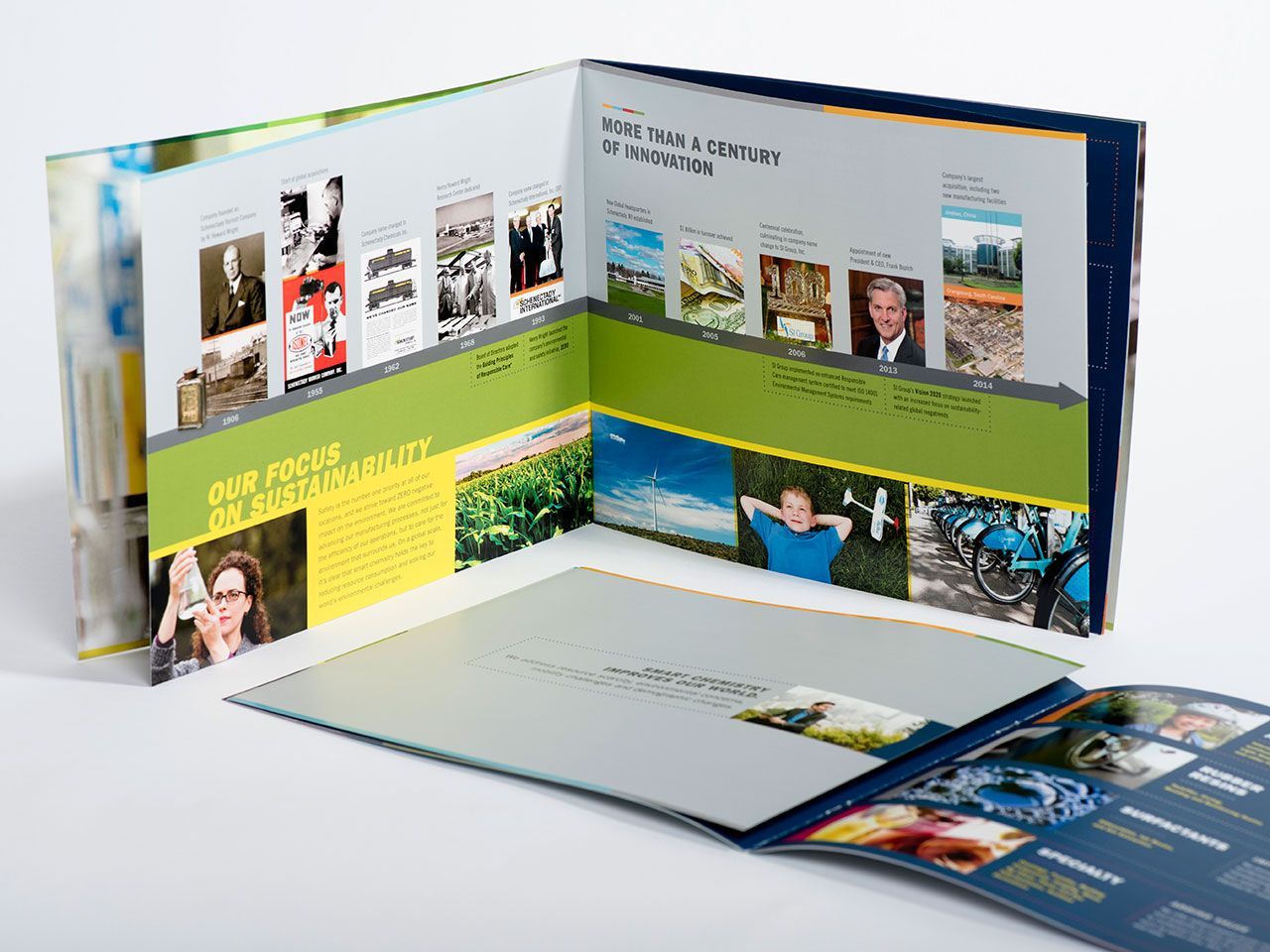
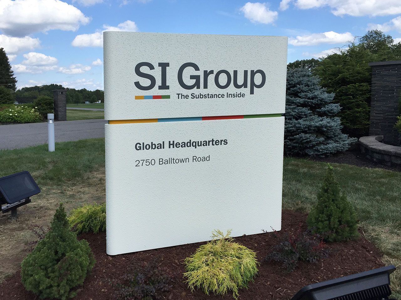
GLOBAL HQ SIGNAGE

SI Group Brand Book: and internal-facing document for aligning employees with the tone of the new brand.

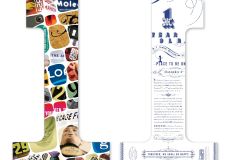
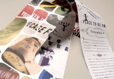
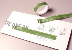
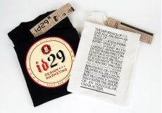
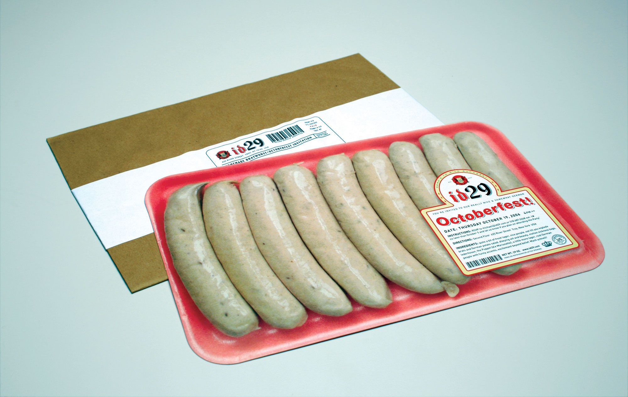
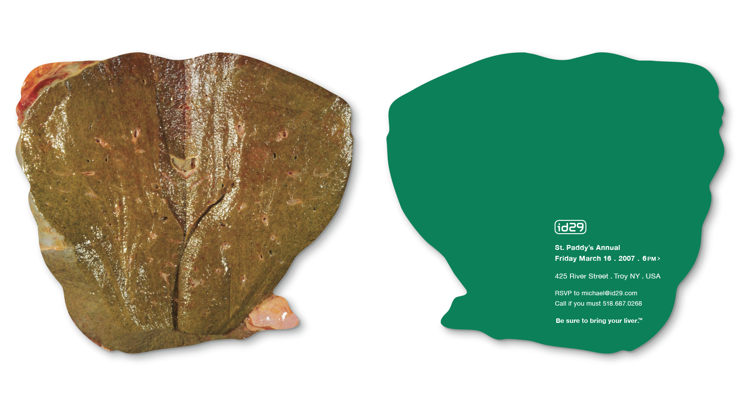
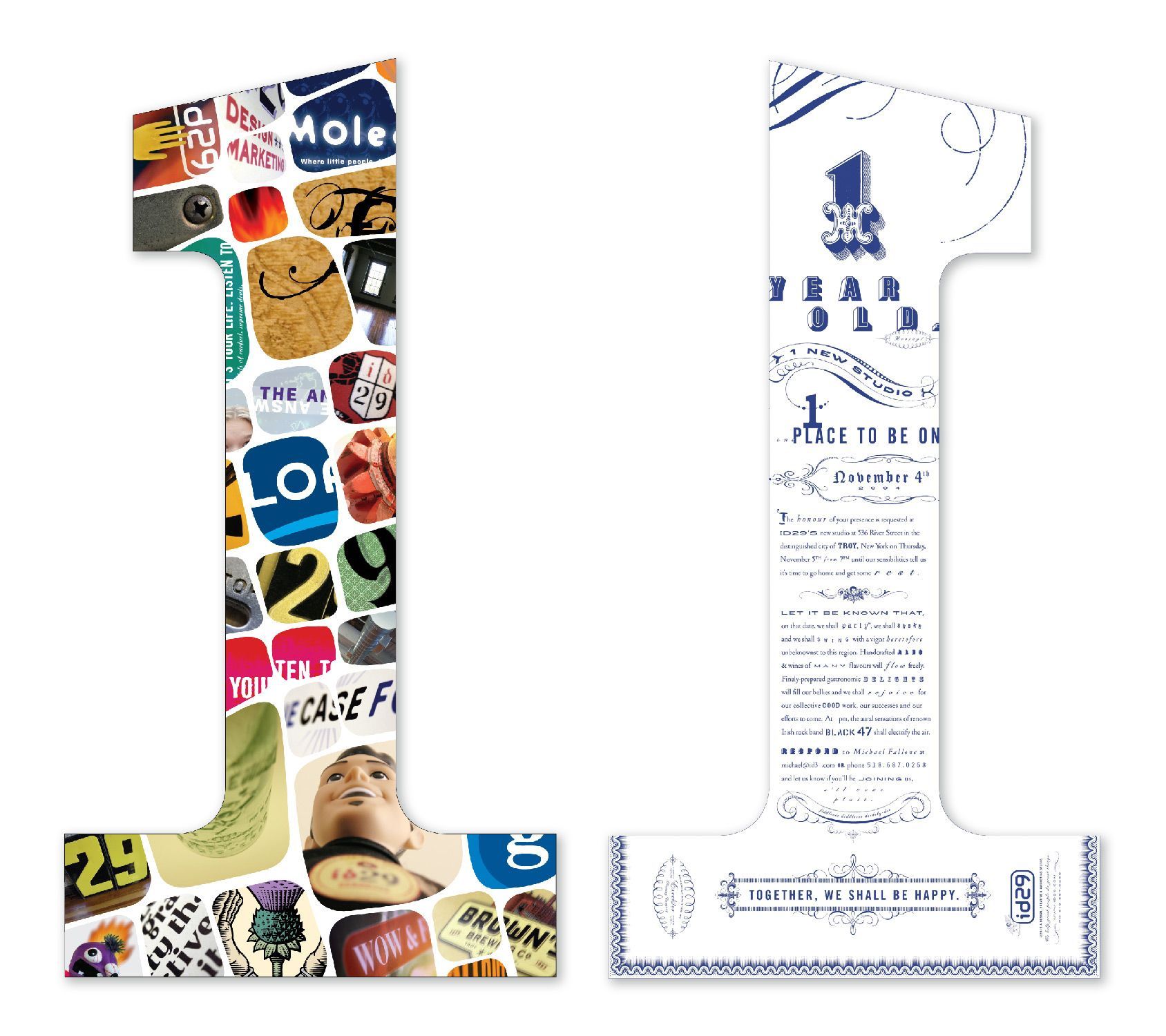
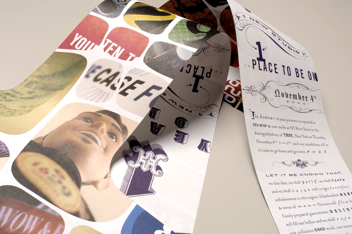
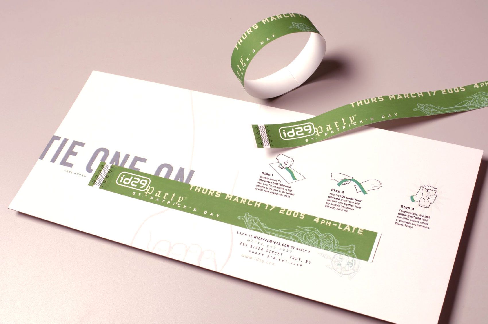
YOU'RE INVITED
Credits
HVCC student photos by Mark McCarty, campaign design with Susan Merrick and Lauren Gay, animation by Nic Hansen, copy by Bryan Kelly/Overit. Albany BID campaign CORE concept with Caitlin Nicholson/Overit. Cedar Knolls Log Homes identity design with Johanna Turano/Overit and front-end dev and design with Mirek Janczur 🇵🇸/Overit. Slay the Scary Monsters collages with Michael Oatman. Invitation, CPG/Rickie Fowler, Bestpass portraits and SI Group photos with Mark McCarty. Cobra Amp video by Aurora Studios. CPG brand book designed with Jake Wright/id29. Harry Potter video shorts with Bryan Kahrs/id29. Dumbledore's Pensieve fabricated with Creatacor. Toll boss illustrations by Vance Kelly.
