
I joined the MASS MoCA project right out of grad school. I walked across the stage at Cranbrook Art Academy's graduation ceremony on a Friday in May, and began at MASS MoCA the following Monday as Director of Design—employee number two. I brought in my own Mac, and we worked with space heaters by our desks—and without paychecks—for 6 months until the project was finally approved by the Commonwealth of Massachusetts later that year.

Sometimes you need to take risks in your career to find rewards. I spent 8+ years at MASS MoCA: four before the public opening, and four after. Working with the talented museum staff and endless supply of world-class visiting visual and performing artists was a privilege. I worked directly with our fabrication team building the early signage and wayfinding system in-house. That's just how we rolled.

IDENTITY DESIGN

I drew MASS MoCA's wordmark before designing simpler variations for use on printed pieces and merchandise. The 'M' symbol was based on a large letterform sitting on the roofline. I used the background of that shape as a lens to promote our visual and performing arts programming. The Hardware store mark was appropriated—with permission— from the complex's former tenant, Sprague Electric Co. 

EXHIBITION & WAYFINDING DESIGN

Getting international visitors from a parking lot through a maze of 19th-century mill buildings to the museum's entrance—or outdoor courtyards—presented unique design challenges at every turn. The complex was built and expanded numerous times over more than 100 years, and was designed for mill workers to walk to their job sites, not for first-time visitors to enter the space. 

  • 2 days before the public opening in May 1999, I cut frisket for this design and sprayed this 'temporary' logo in the main entrance of Building 10. I still have the tennis sneakers covered in spray paint. It finally got replaced 10 years later. ;)
  • Getting international visitors from the parking lot through a maze of mill buildings to the main entrance required international iconography.
  • Interior Donor Recognition Signage (screenprinted on cor-ten steel plates)
  • When we needed custom brochure and literature displays, we designed and built them ourselves using steel pegboard. Core-ten steel slabs raised off the existing brick wall (background) were an easy way to apply vinyl lettering for the current gallery exhibitions. Each show got its own visual identity.
  • Still one of my favorite design projects at MASS MoCA—adding custom numerals to the campus buildings, as prescribed by the 1988 MASS MoCA Design Charette (with Frank Gehry, Robert Venturi, and David Childs of Skidmore, Owings & Merrill)
  • Note to young signage designers: make sure you oversee all aspects of such installations. The riggers had originally planned to install the letterforms starting at the end and working backwards before I informed them of the potentially embarrassing spelling of the sign without the initial ‘M’.
  • To date, this is still the largest signage installation I have designed. I like the fact that it's reverse-reading from inside the campus. I always thought that spoke to the idea of demystifying the art making process—for which MASS MoCA is well known.
  • Occasionally, we had to send out jobs that required a level of finish and permanence above what we could accomplish in-house.
PRINT DESIGN

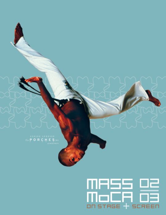
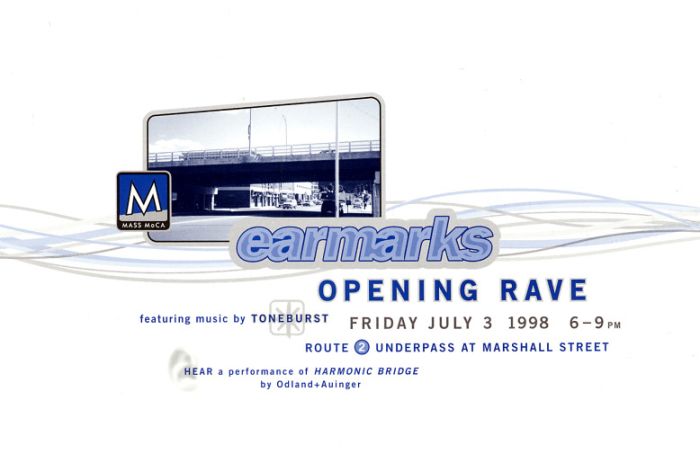
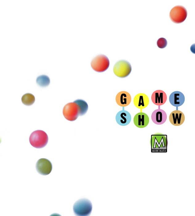
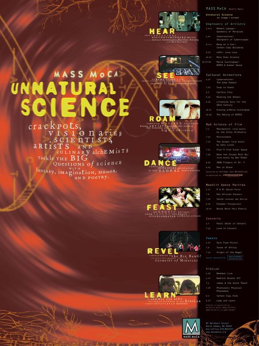
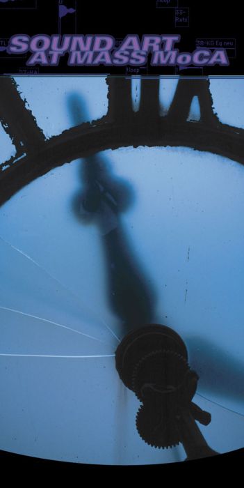
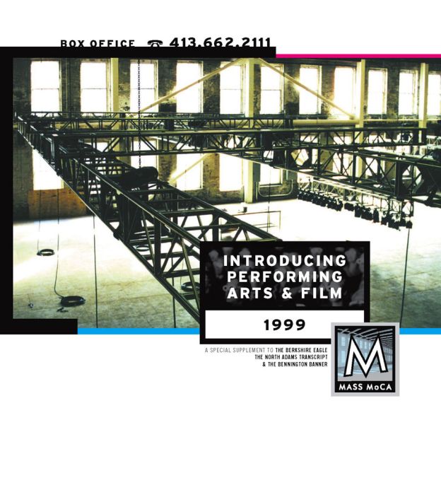
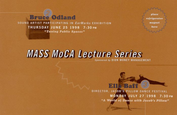
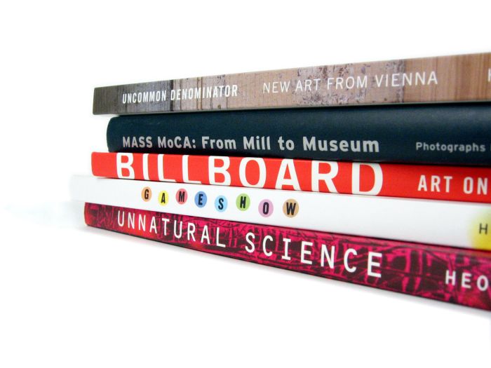
The internet was relatively new in 1995 when I started at MASS MoCA, so we did a lot of outreach via traditional print and direct mail. Additionally, I designed and oversaw the print production of: performing and visual arts program guides, exhibition catalogs and posters, fundraising materials, gallery brochures and map guides, and gallery exhibition cards, to name a few. 

WEB DESIGN
1997
2000
2001

massmoca.org

If you don't recognize what an old Netscape browser window looks like, then you're not old school! There was no fancy web type nor Google fonts back in the day; if you wanted web typography to look as intended, you rasterized it and hand-coded clunky image maps. And we liked it, we loved it! (shakes fist)

ROOF SIGN

The Building 12 roofline held the original Sprague Electric Co. sign until it was deinstalled in the mid-1980s. It made for a logical choice when planning for and designing the MASS MoCA roofsign location. The rest of the installation, however, was much more difficult.

To get approval from the City of North Adams, my intern Steve and I built an 8' tall capital 'M' out of plywood, spray-painted it silver, and dragged it up on the roofline of building 12, which faces City Hall. A thumbs-up from the Mayor was followed by 2 years of political bureaucracy until we finally got a variance approval for installation. 

Capturing before and after images at MASS MoCA never got old. This is the large Building 5 gallery after the floor was removed, and (rollover) after the May 1999 Opening with Robert Rauschenberg's The 1/4 Mile or 2 Furlong Piece.

Credits

Flyover image of MASS MoCA by Douglas Mason, used with permission by MASS MoCA. Roofsign and Building 5 images by Nick Whitman. Fixtures by Richard Criddle and the MASS MoCA Fabrication Team.